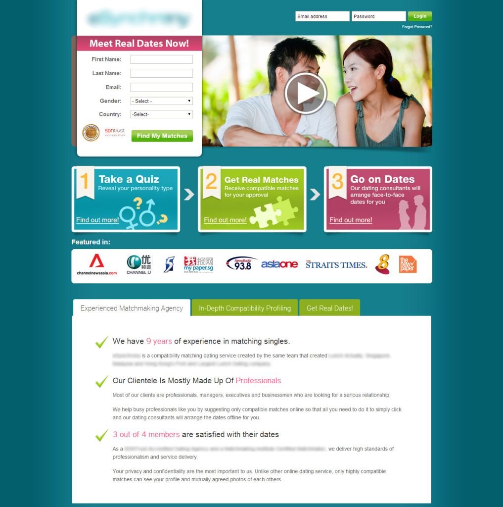
Design was generic, sparking no real emotions. The couple felt neutral
The video distracted more than it helped
Colors and layout felt stifling and cheap. Not inviting
Messaging (“Meet real dates now”) only promised short-term results. It ignored the powerful matching technology and failed to target serious, paying users
Plenty of “escape” links pulled users away from the funnel, distracting them from making a decision
before
Audience Insights
Most paying users were Asian men.
Original messaging pushed short-term results (“Go on a date soon”), while the company’s real target was people looking for serious, long-term relationships. Result: users registered but didn’t pay.
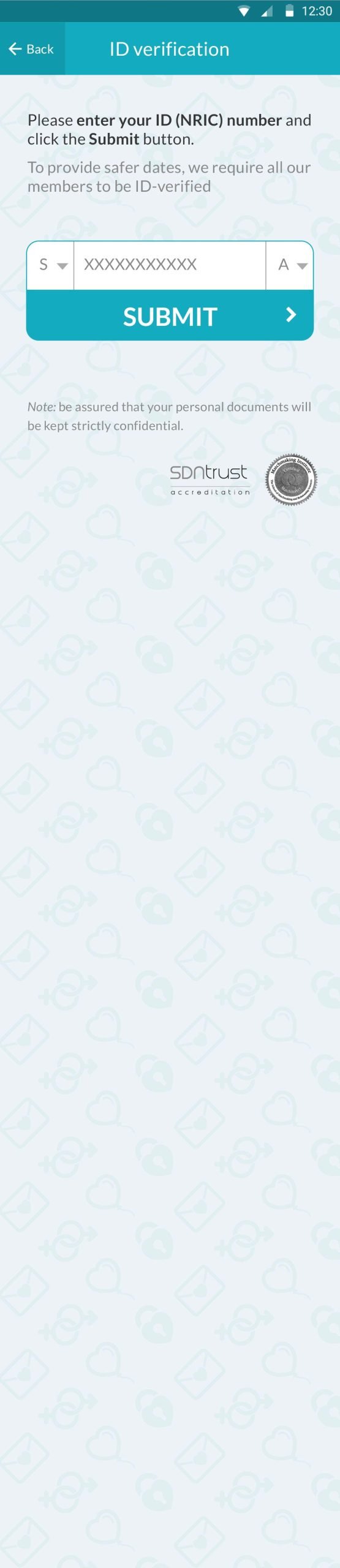
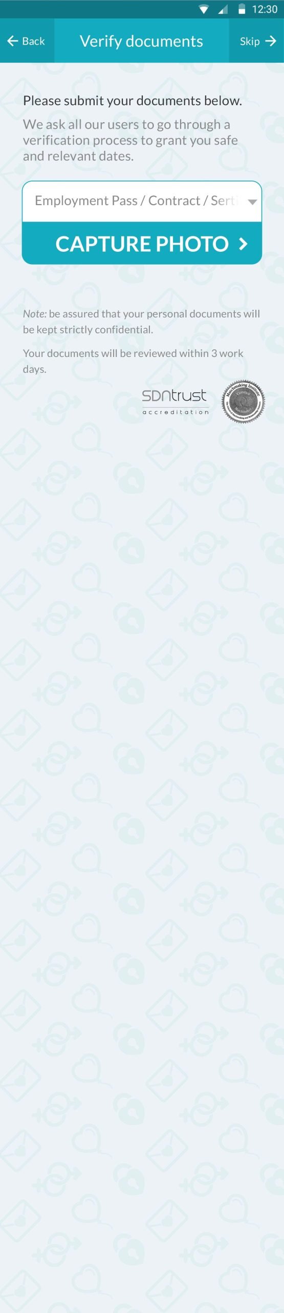
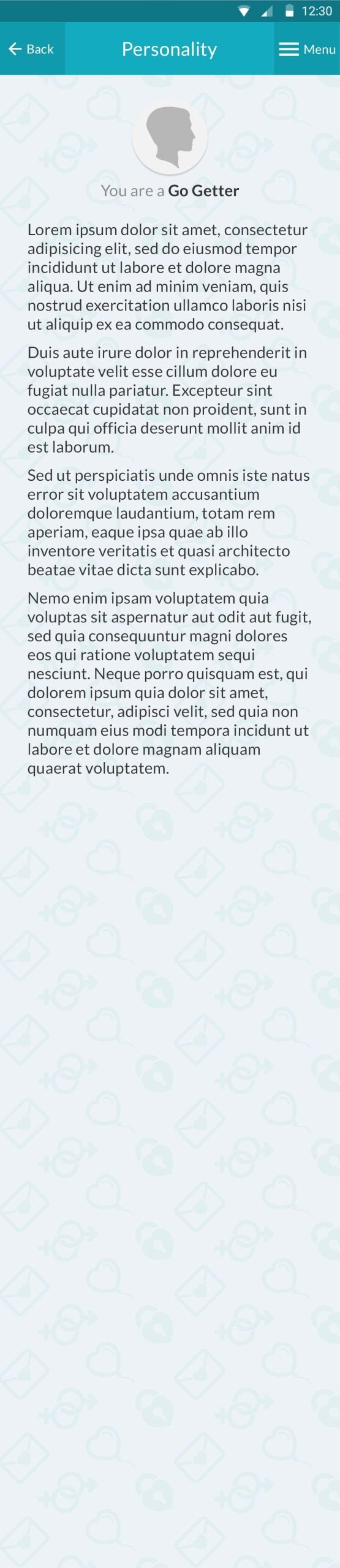
Trust, security, and privacy were critical. Successful, goal-oriented users are cautious about sharing personal info.
Paying users are goal-oriented—so demonstrating star experts and algorithm efficiency matters.
strategy
Design & Colors
Kept corporate palette but redistributed it for a lighter, more inviting feel
Introduce emotional targeting in imagery
Messaging
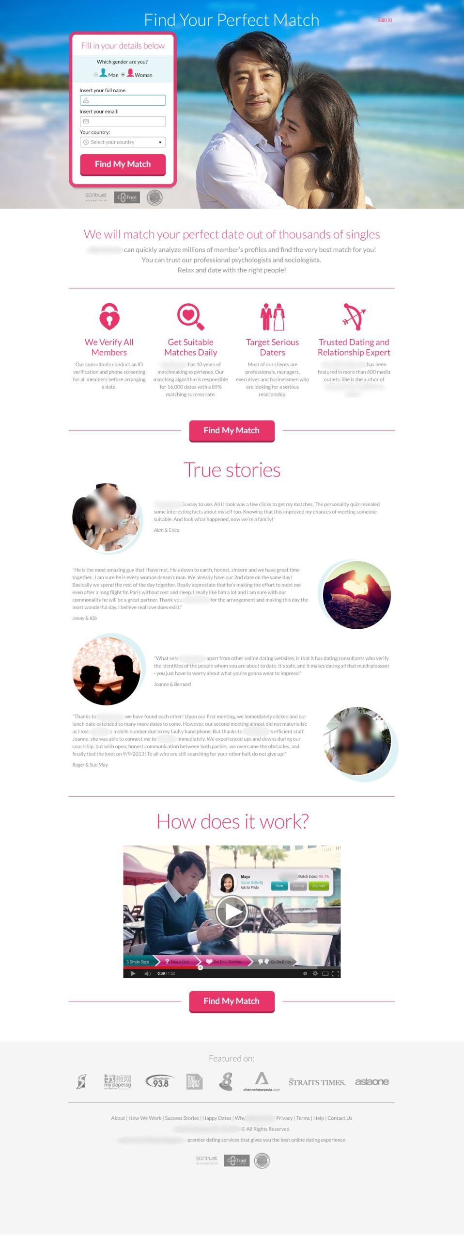
New message: “Find your perfect match”
Not about wasting energy on another bad date. Not about one-night stands
About efficiently finding a real soulmate
Triggering hope and optimism
Supported with real people’s love stories to build trust and credibility
Emotional Focus
Yes, it’s another romantic couple on a sunny beach.
But the choice was deliberate. Most paying users were conservative Asian men. The emotion wasn’t just romance—it was about possession and obedience, framed positively within a traditional relationship context. (Howdy, fellow feminists, cue the rotten tomatoes! 🙃)
Still, the design had to be:
Clear and instantly understandable (one CTA)
Trust-focused
Pleasant, luxurious, and inviting
AFTER — Variation 1
AFTER — Variation 2
Technology & Variety Focus
This version highlighted the wide range of people users could meet.
Second focus on technology: the innovative algorithm that matches serious relationship seekers through deep personality analysis, shared life plans, and preference similarity.
Goal:
Make the service feel easy to use yet sophisticated, full of possibilities but never overwhelming.
The design emphasized diversity, attractive people, and real outcomes.
summary
before
Generic design and wrong messaging
Distracting video
Small CTA
Weak emotional targeting
Numerous escape routes
after
Positive goal-oriented messaging
Emotional targeting
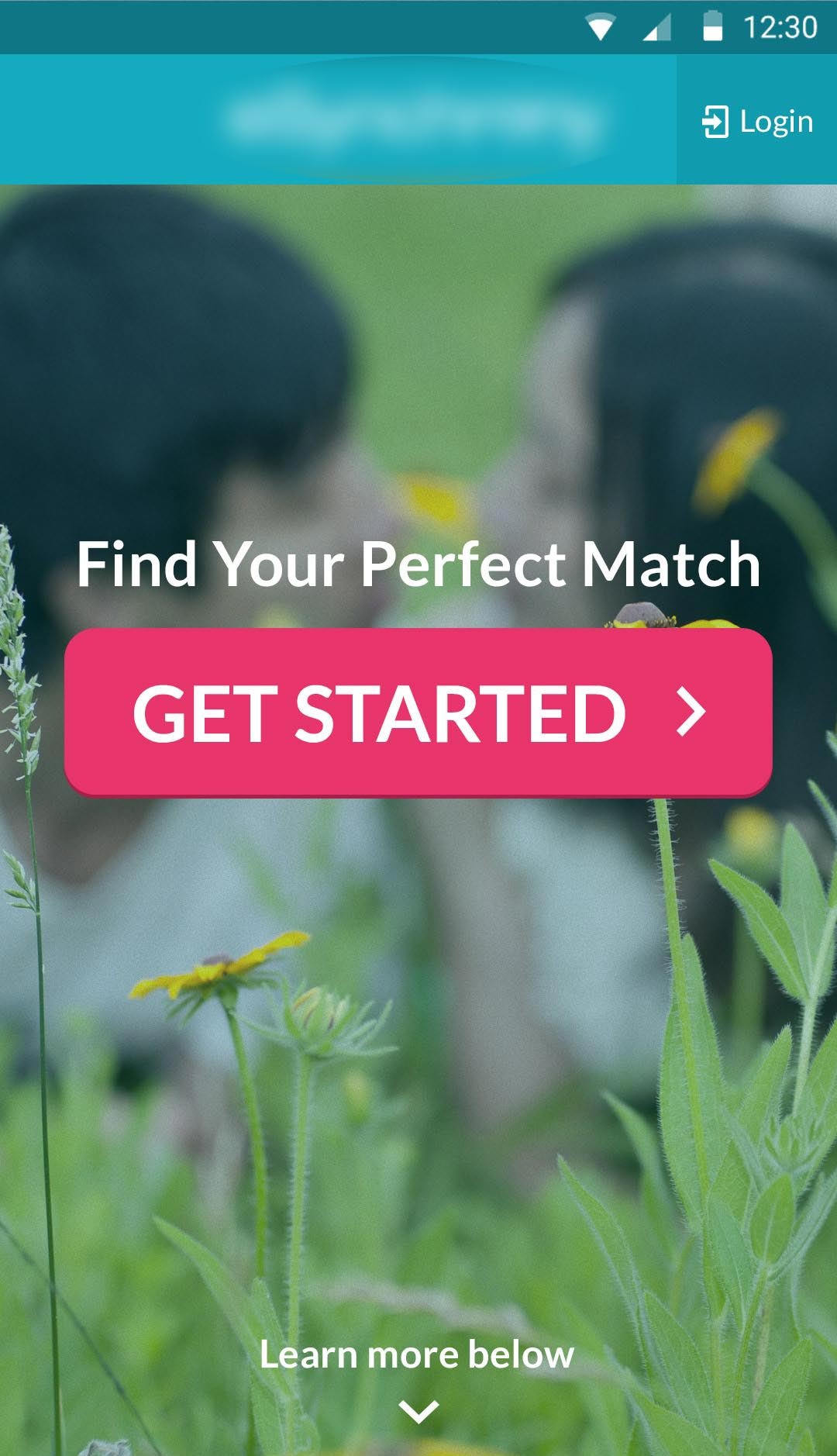
Clear, prominent CTA
Simplified form fields
Escape routes minimized
Shorter texts with icons
Explanatory video added
Pleasant, trustworthy atmosphere
0
%
Sign-ups
0
%
Paying users
0
Winning version
stage 2
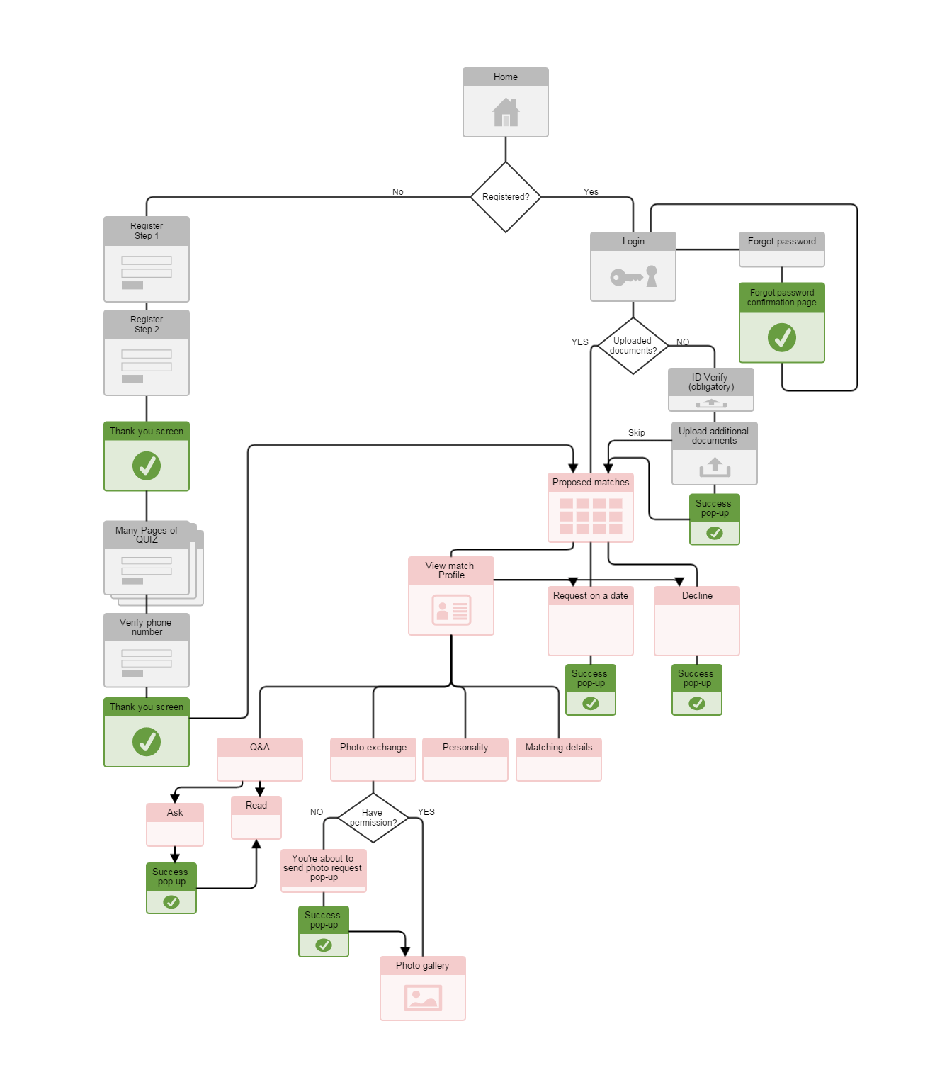
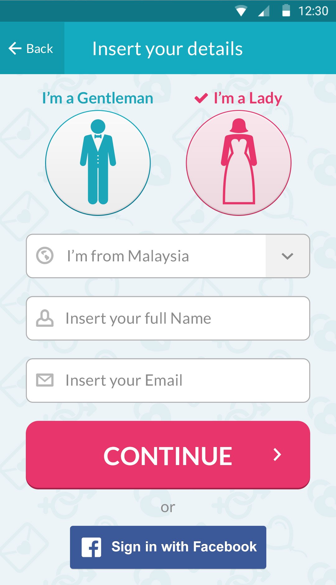
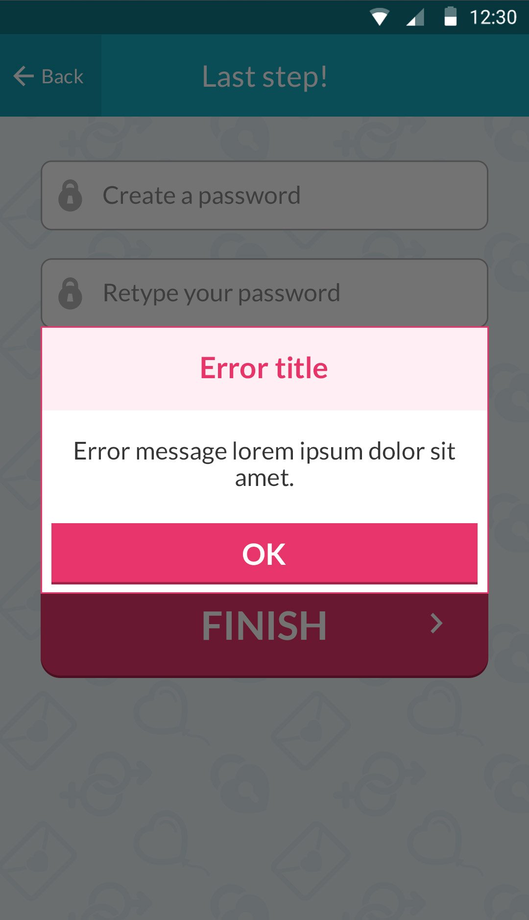
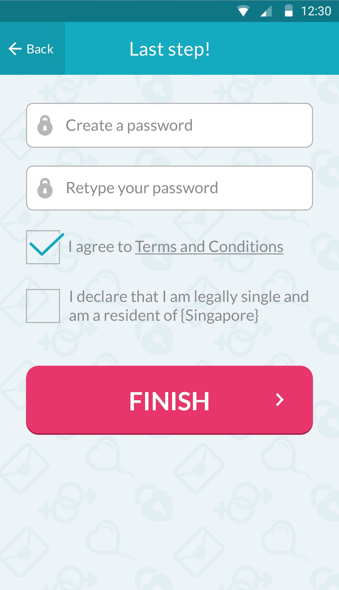
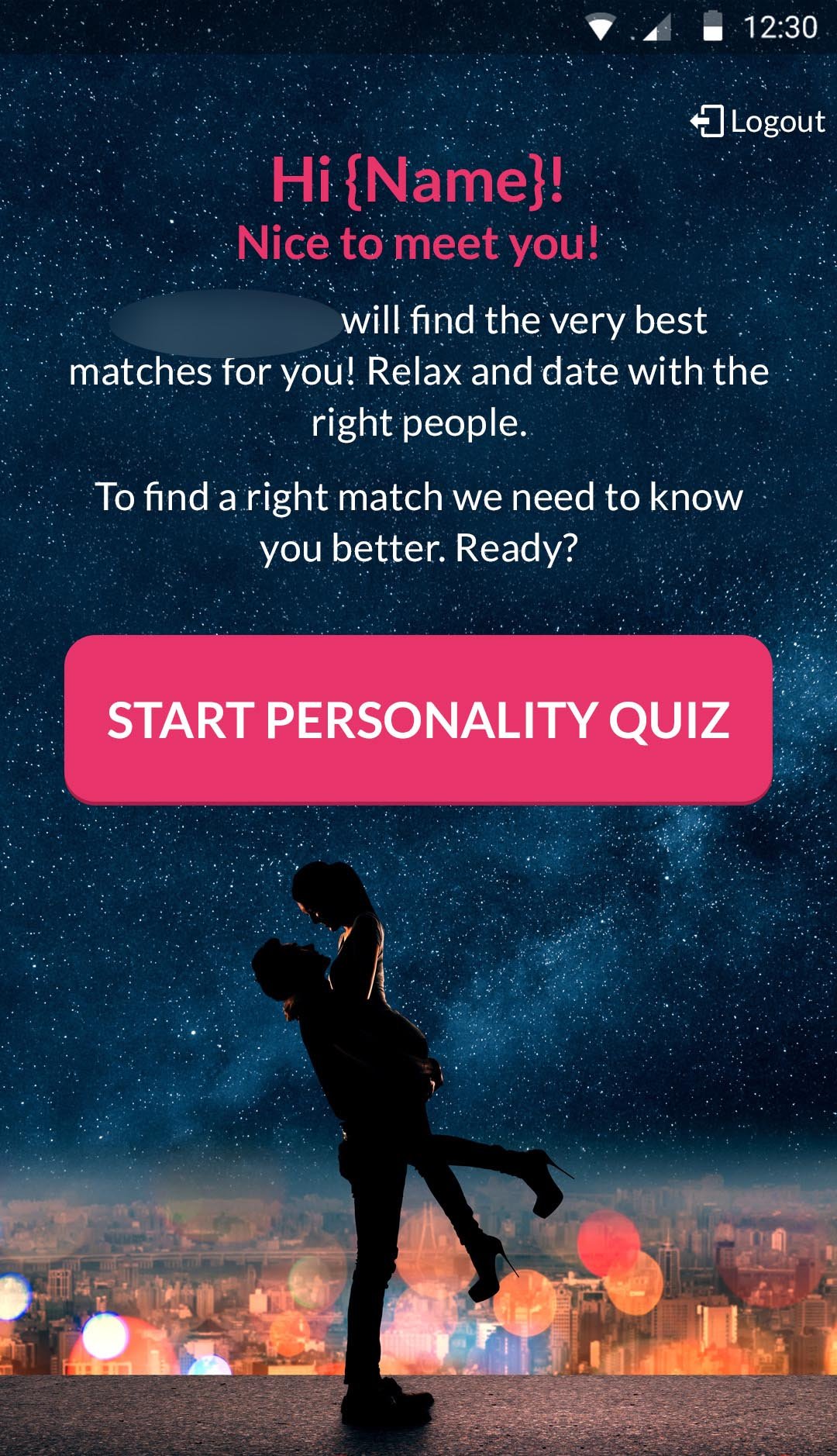
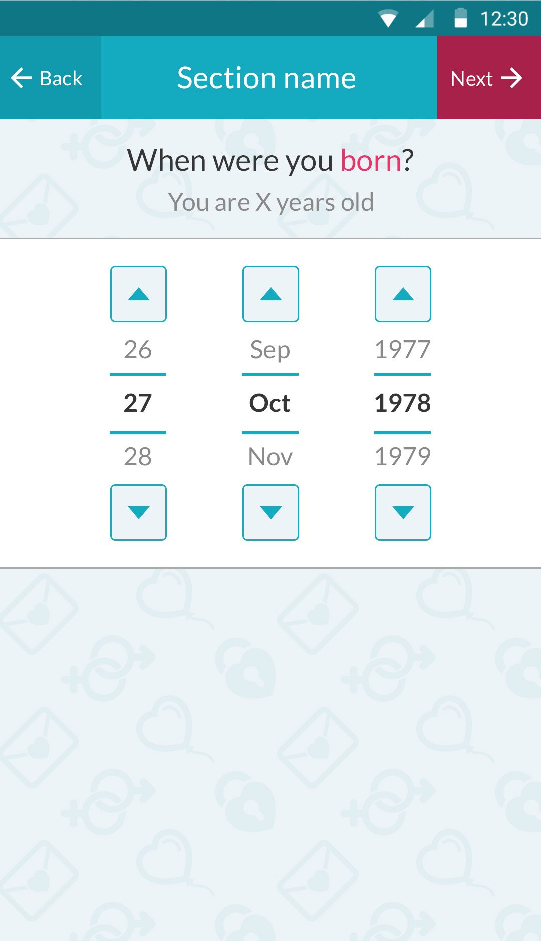
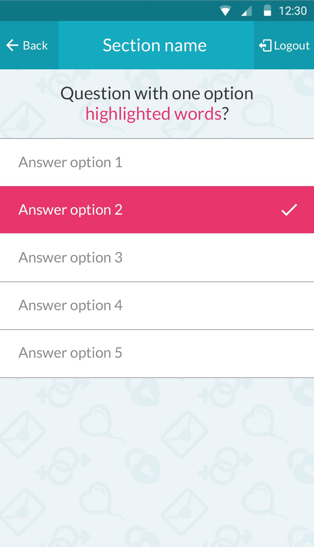
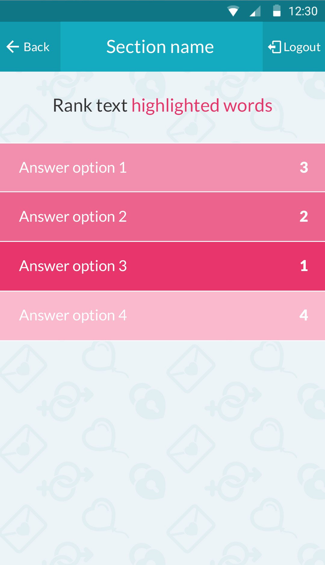
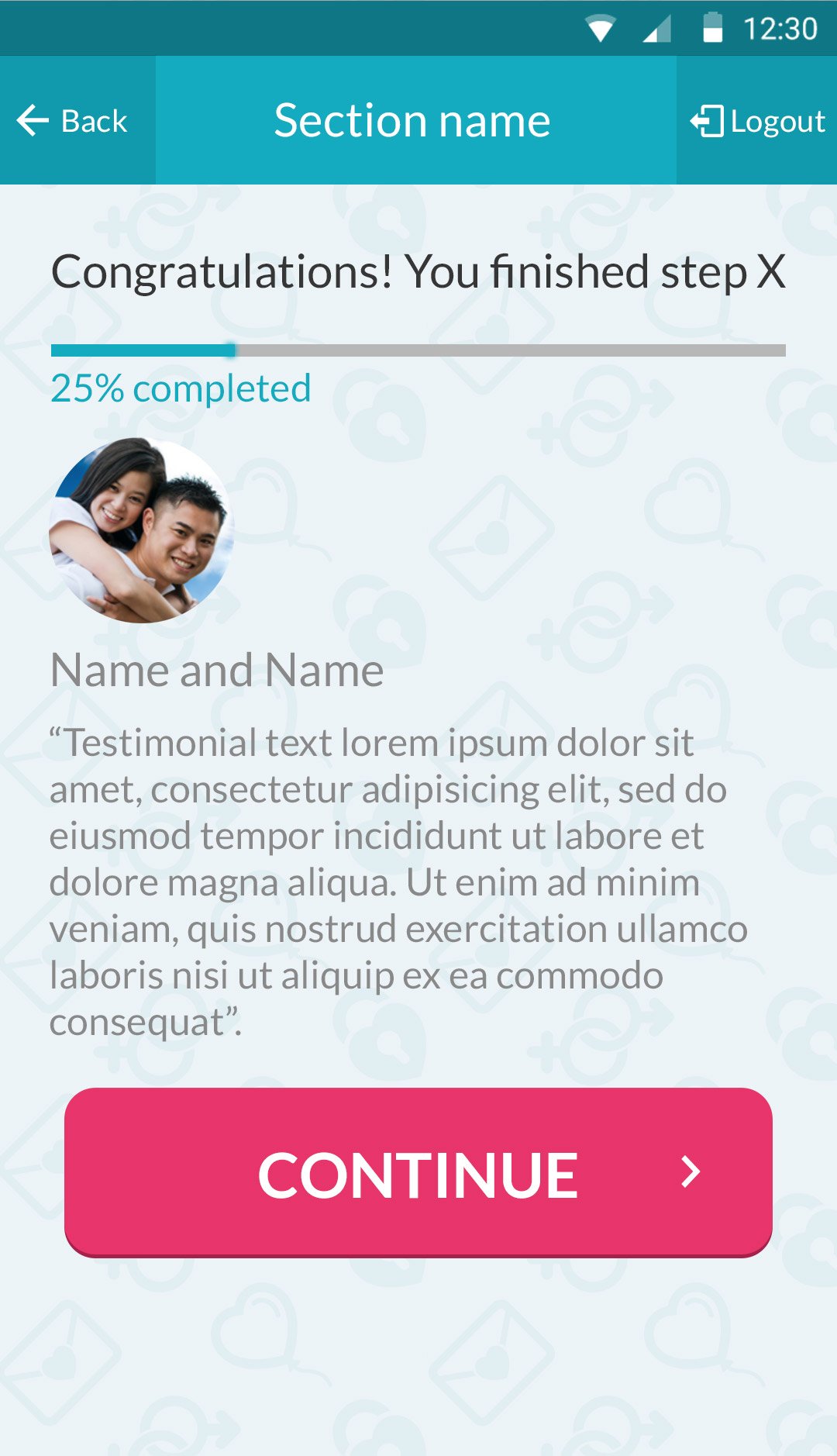
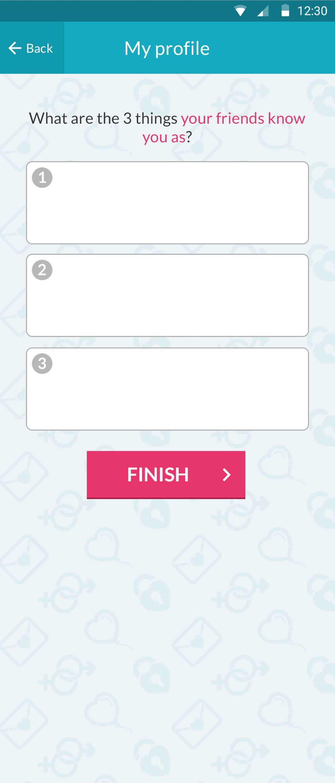
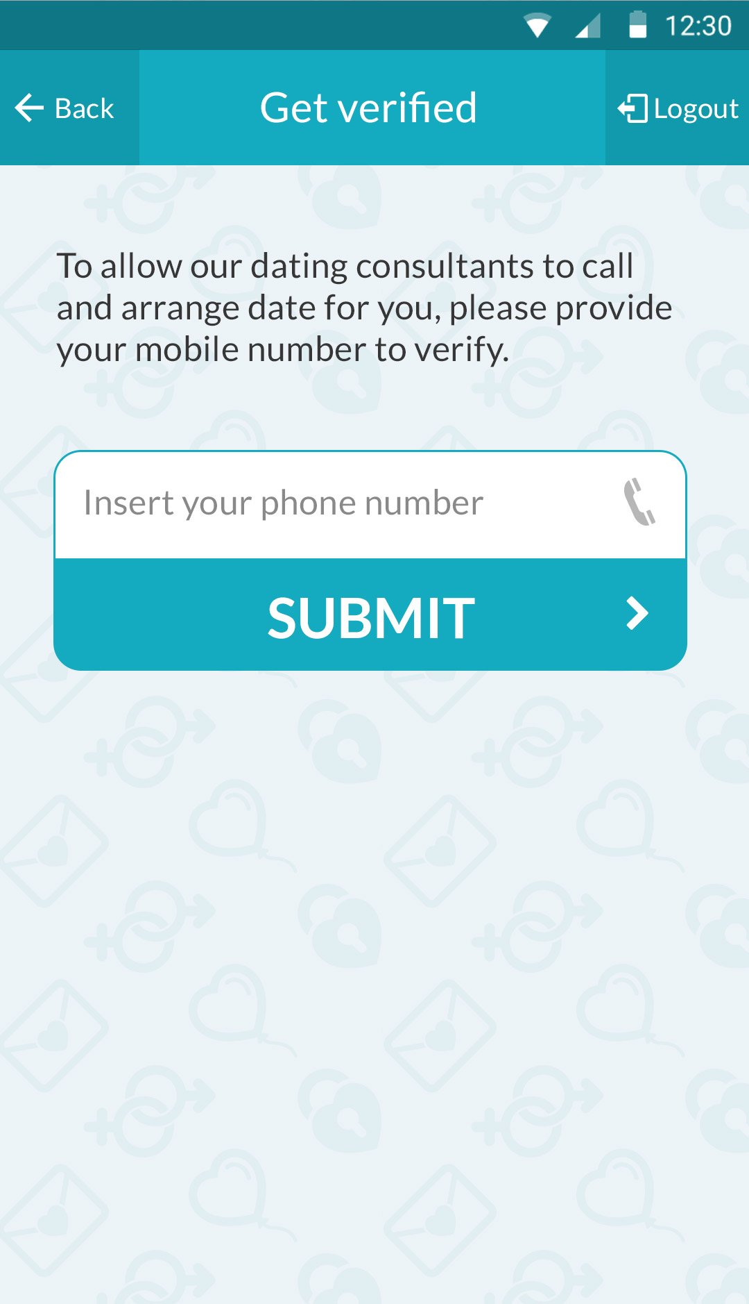
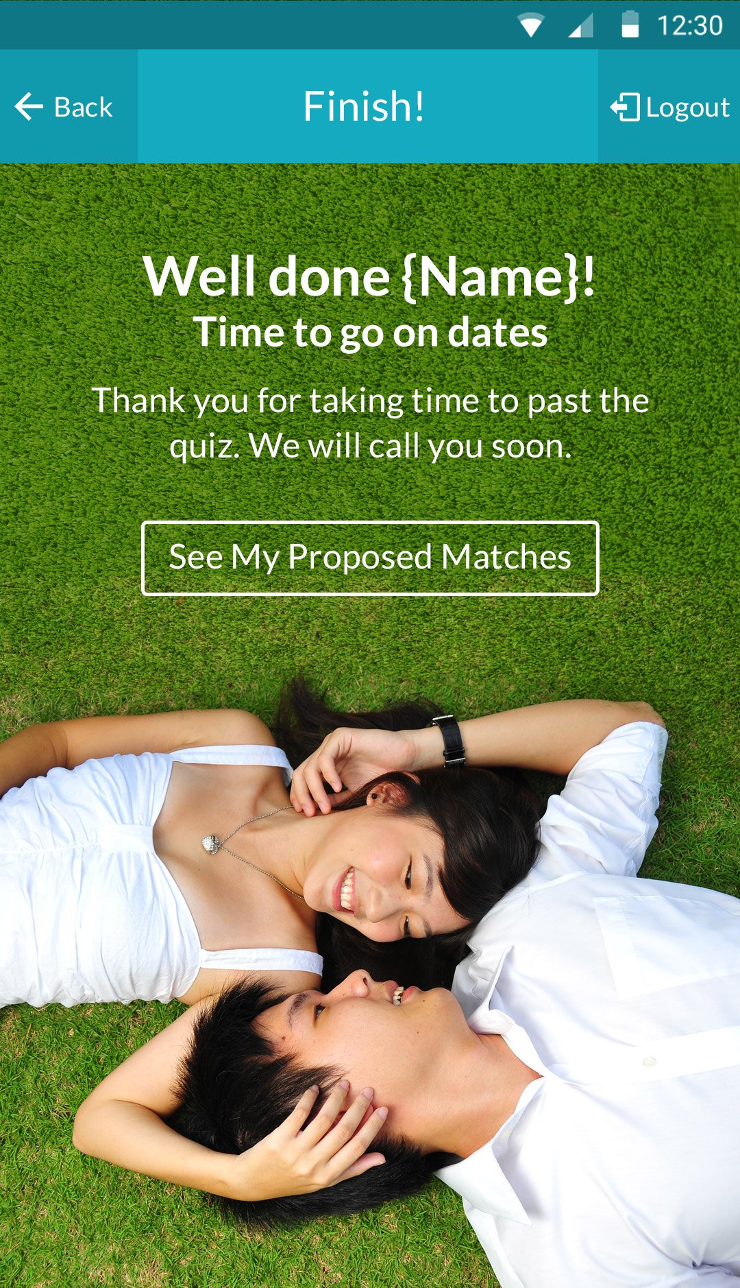
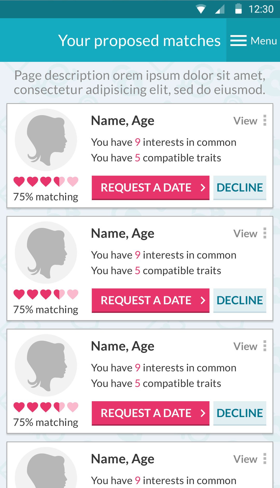
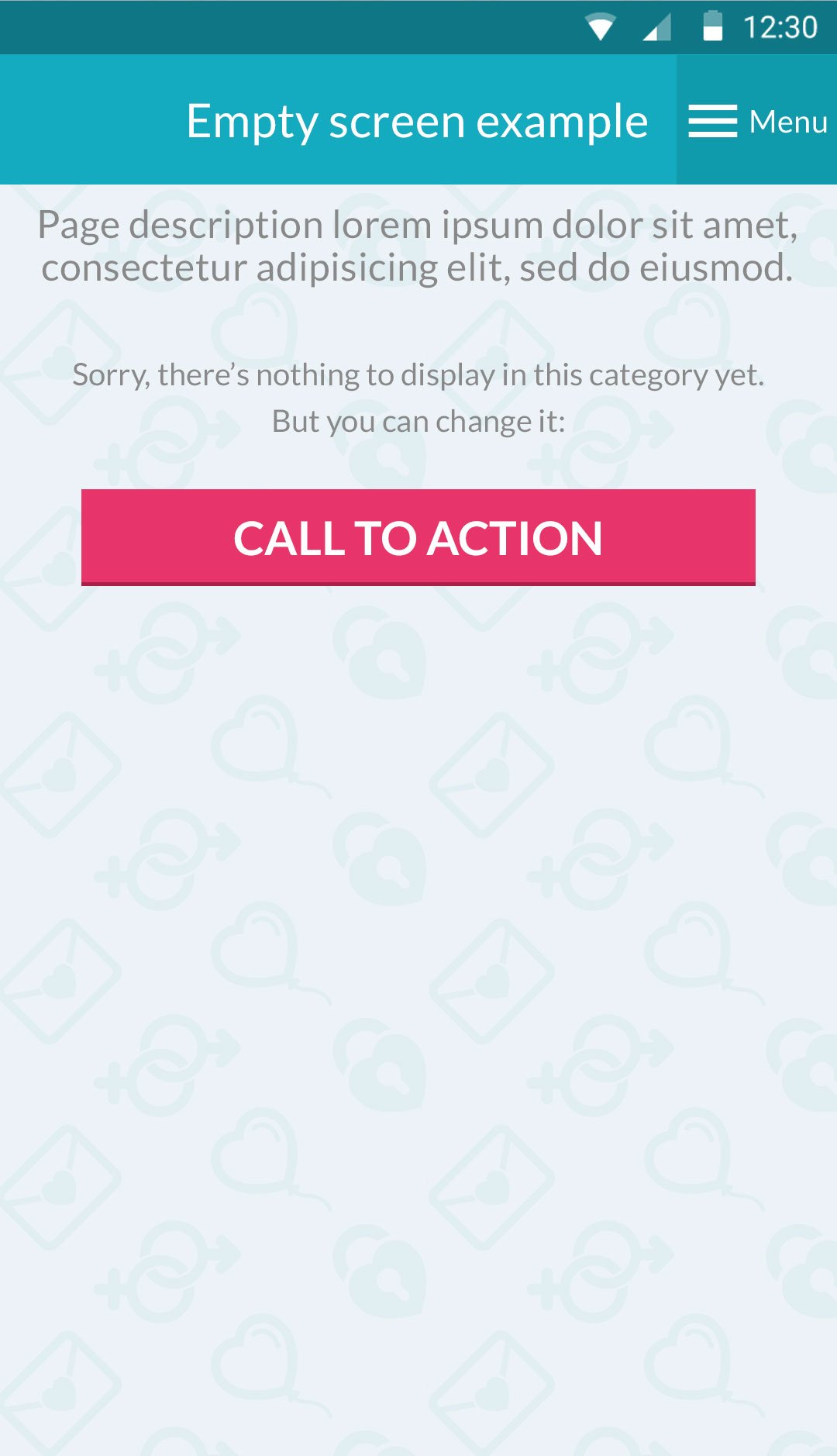
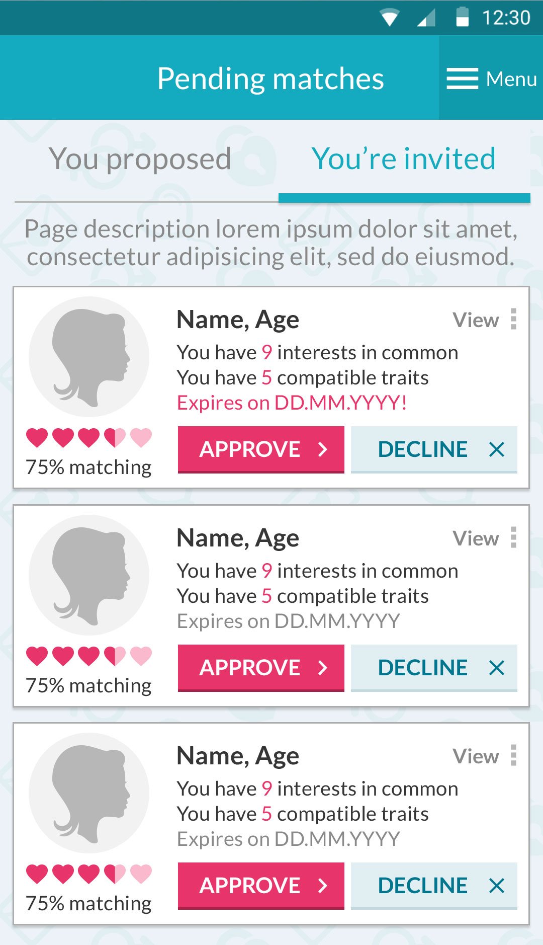
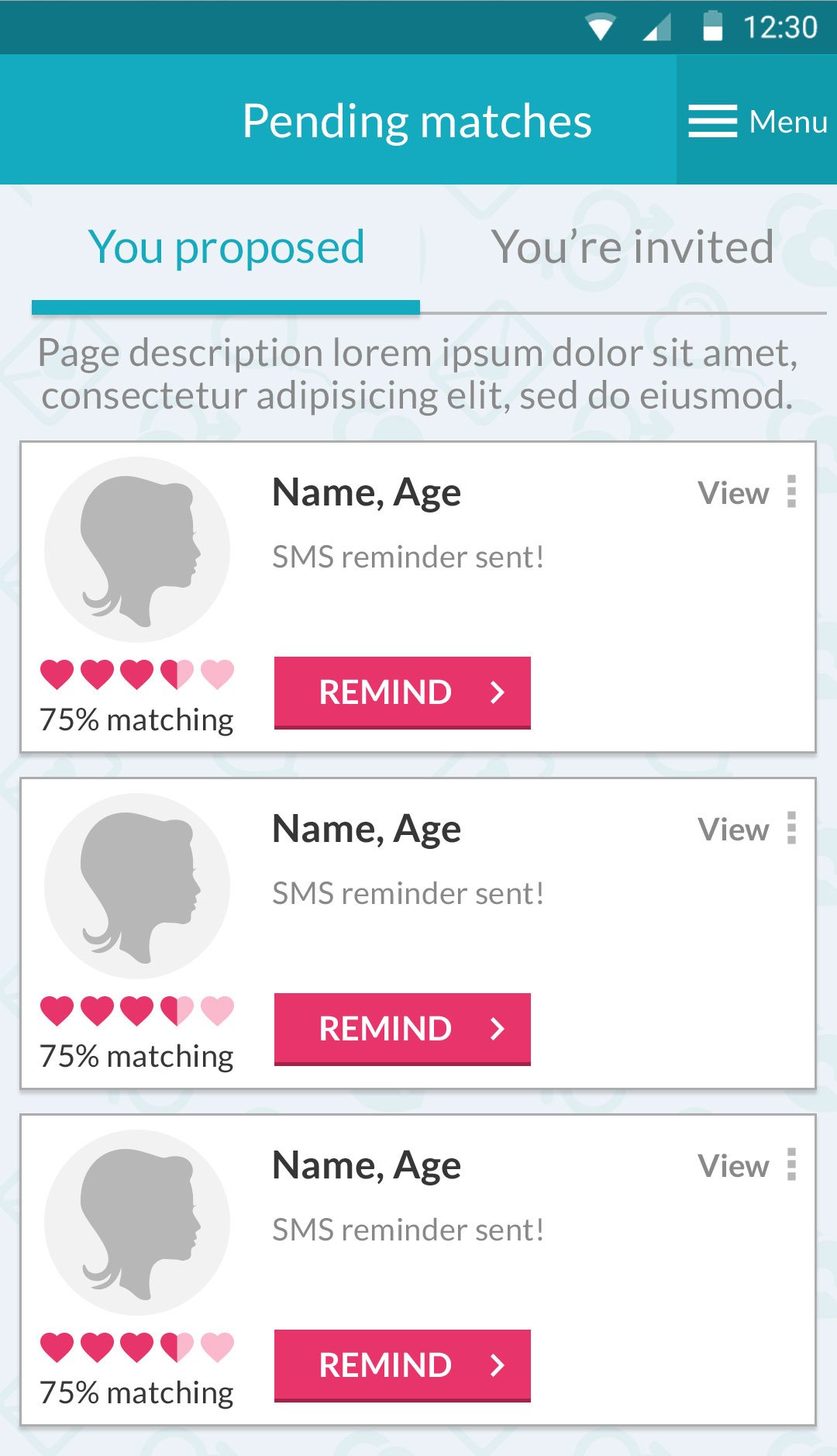
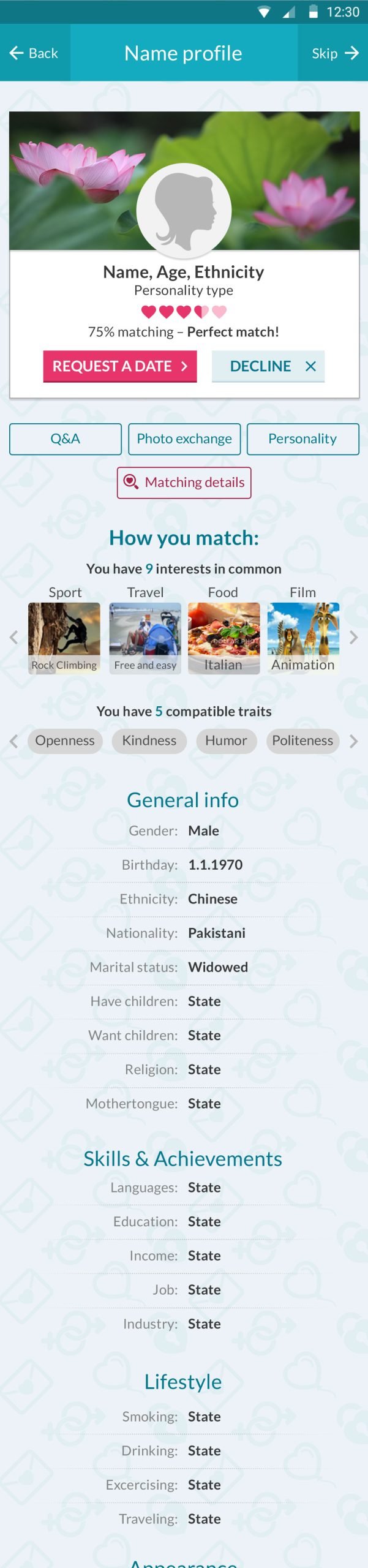
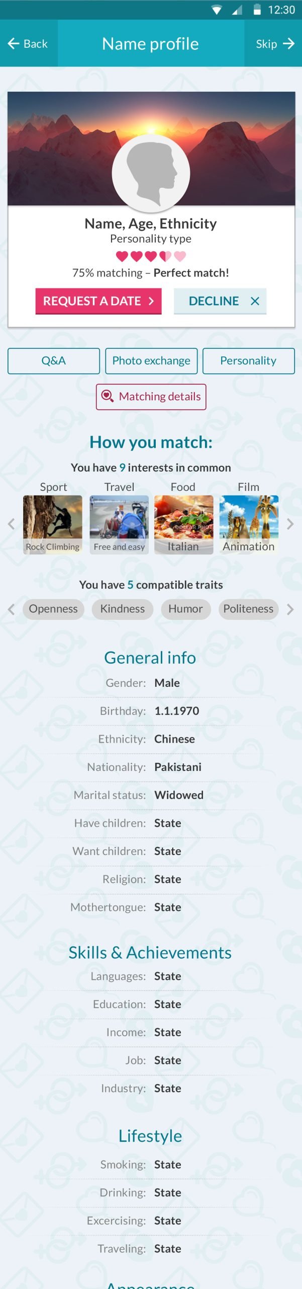
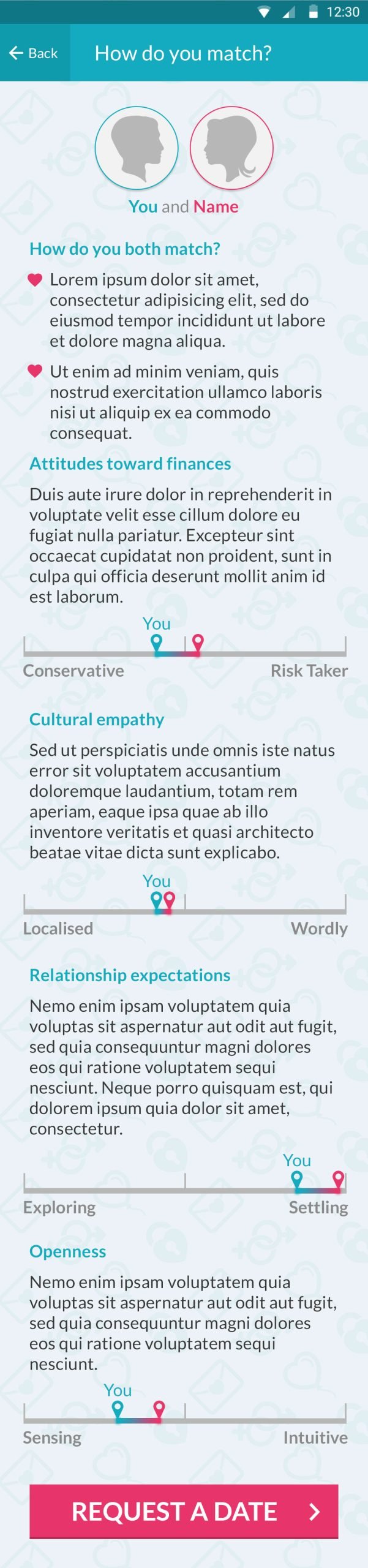
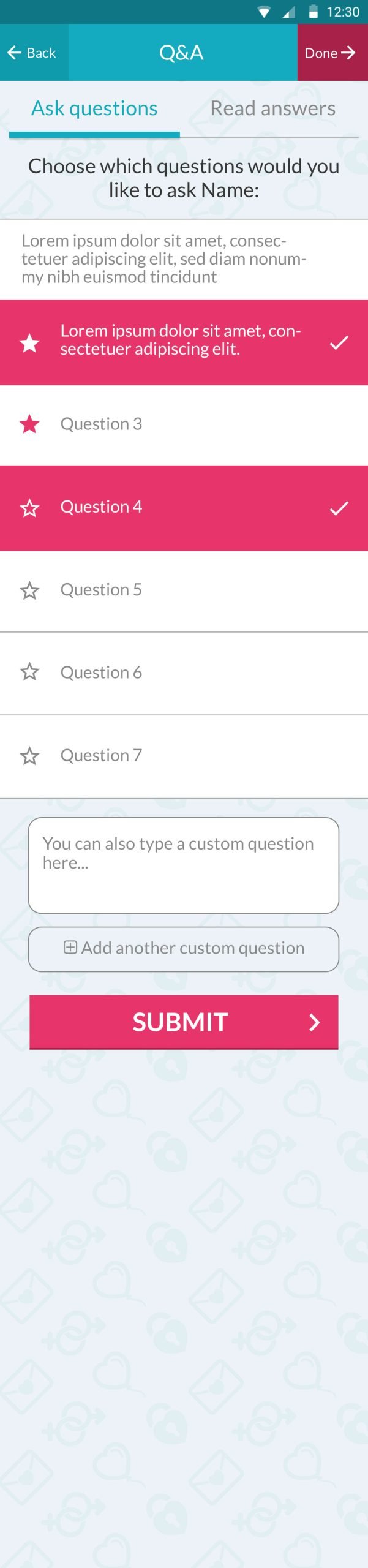
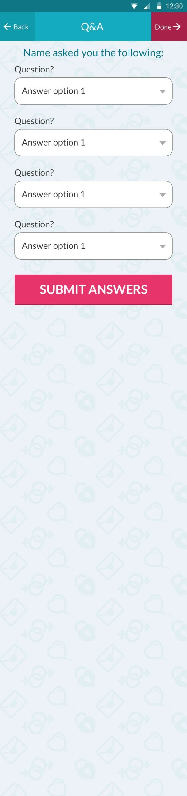
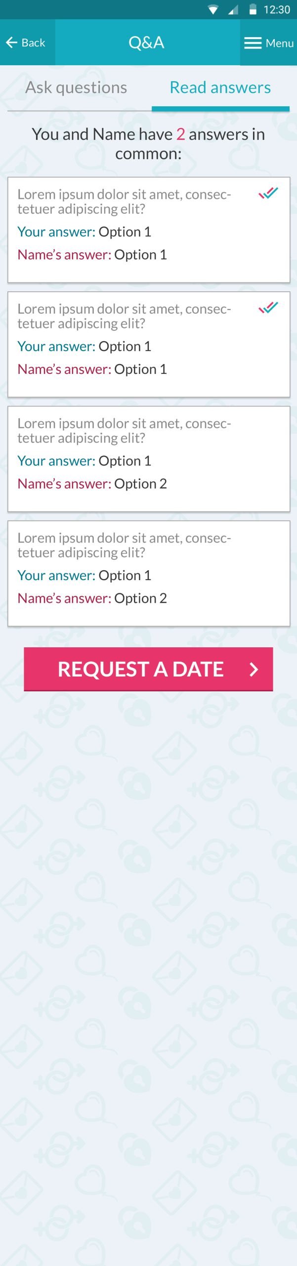
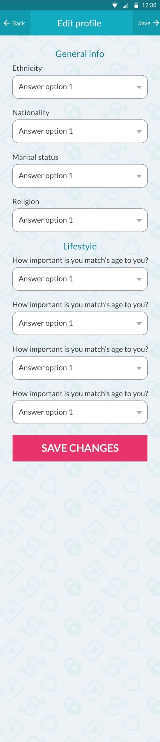
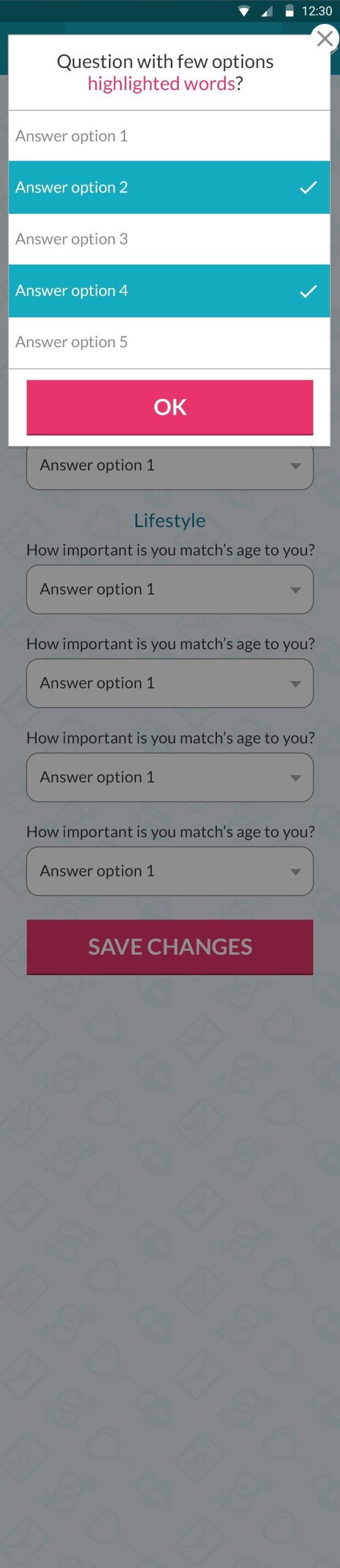
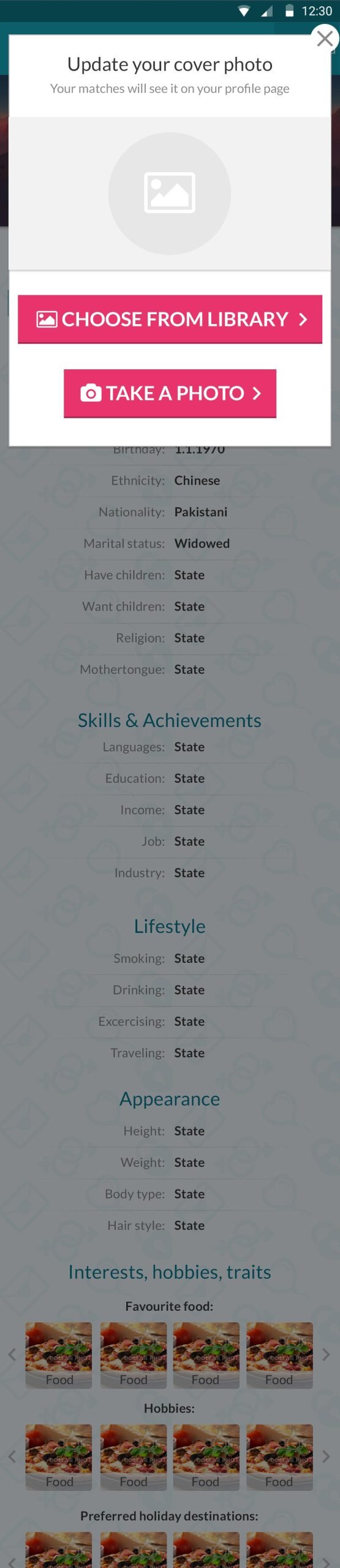
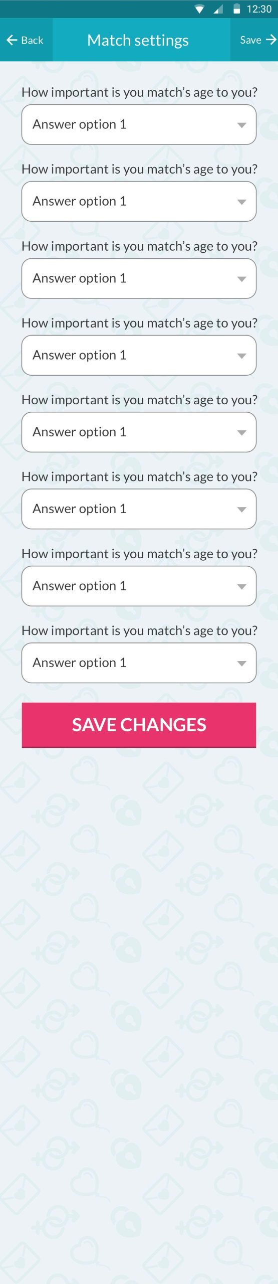
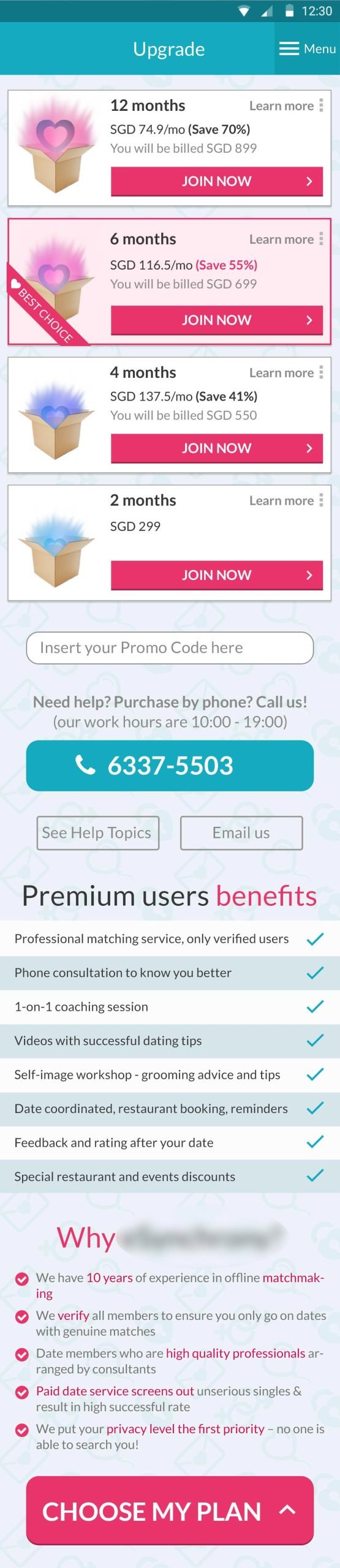
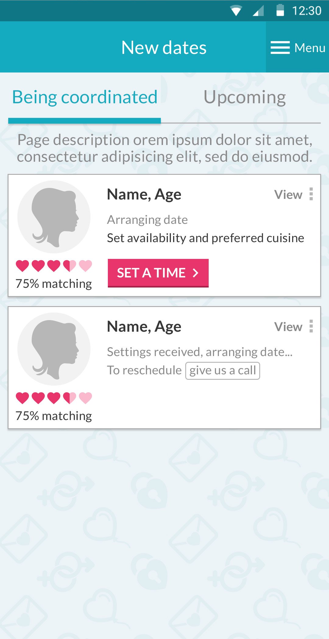
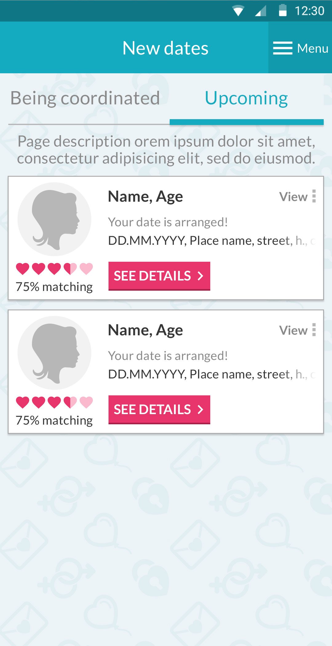
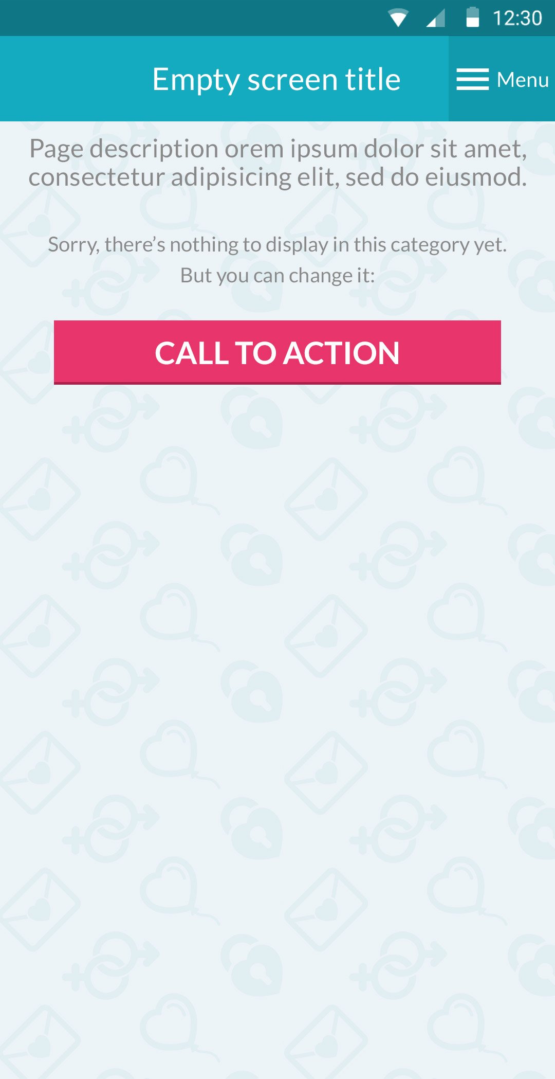
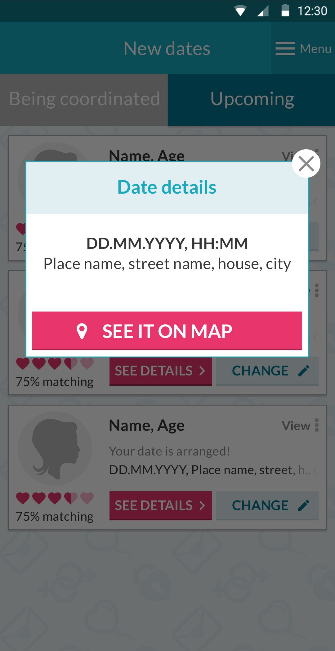
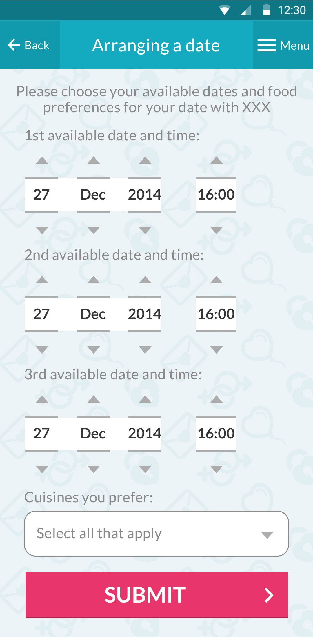
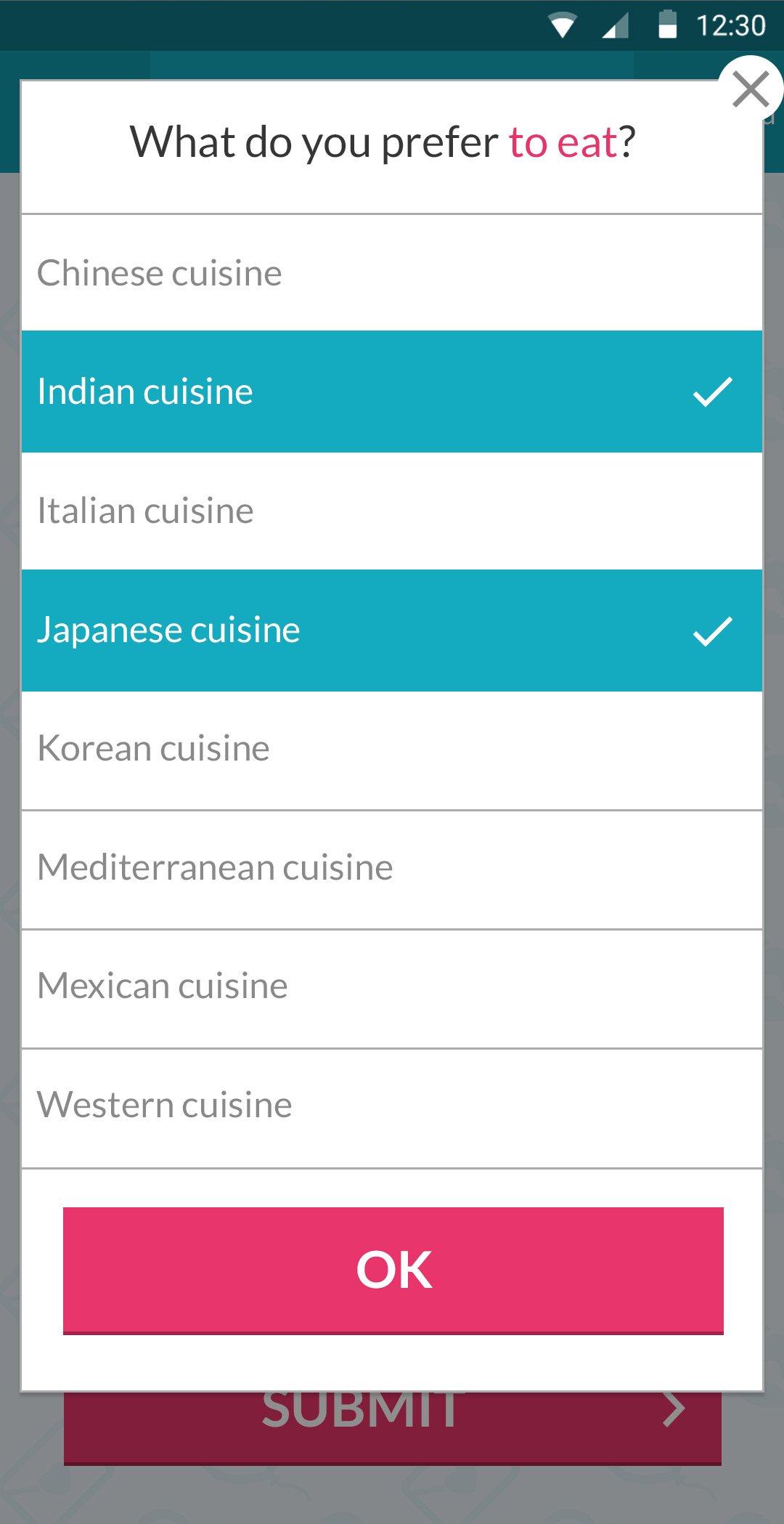
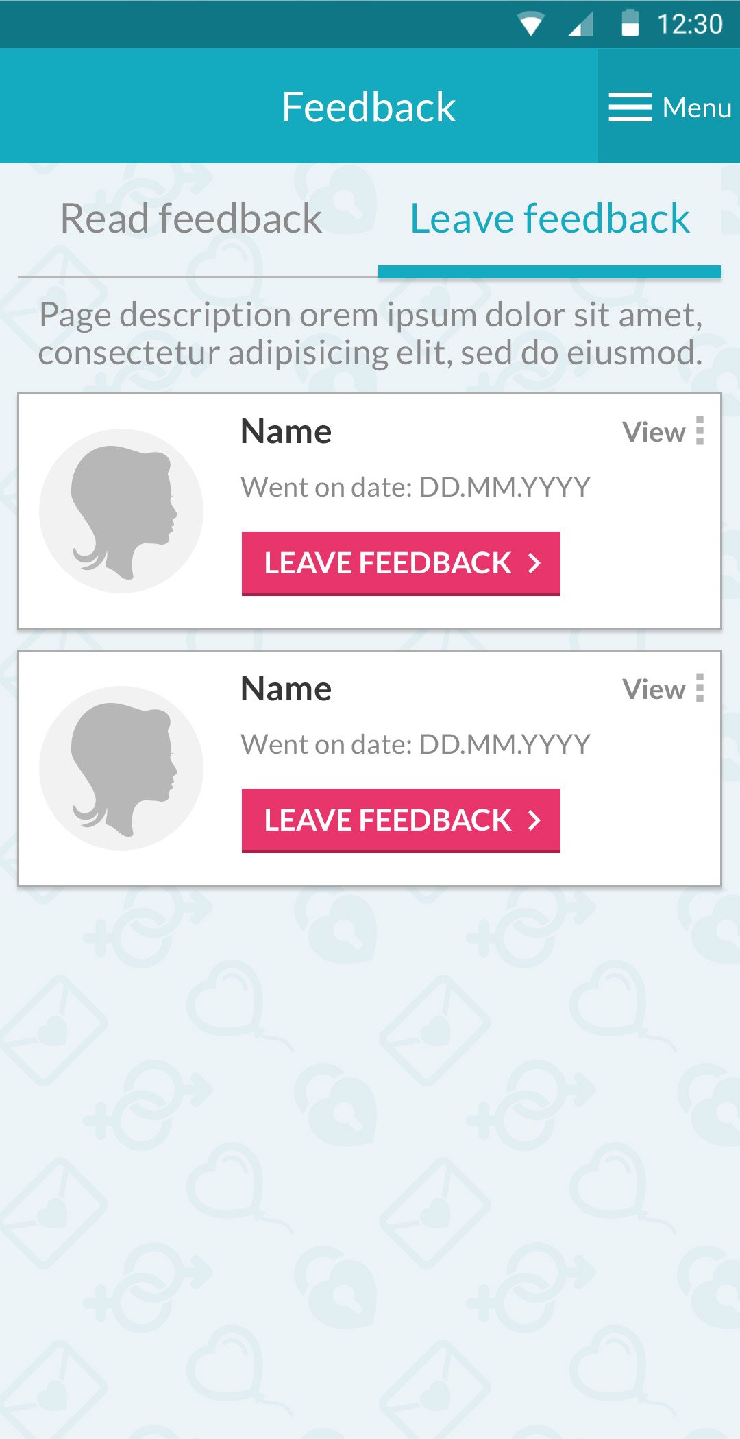
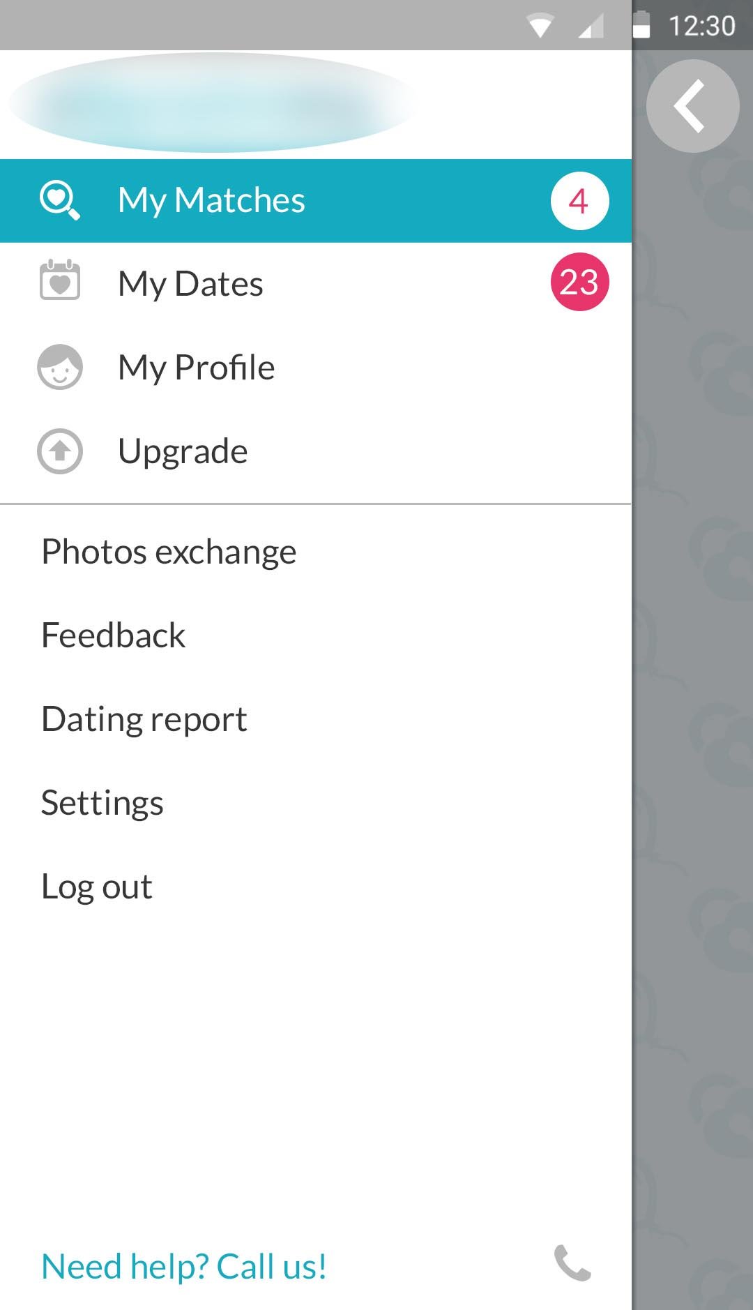
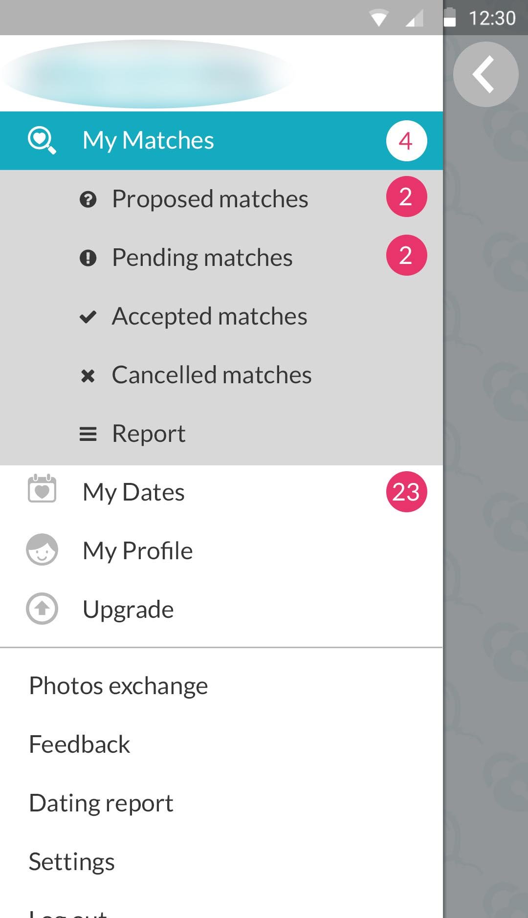
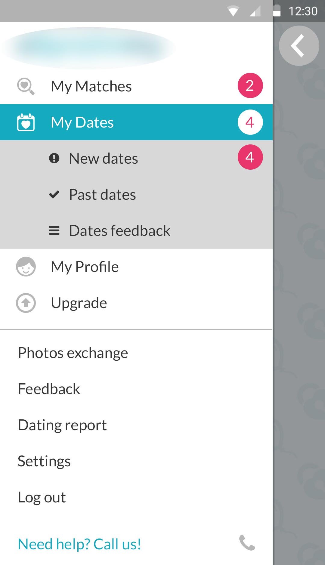
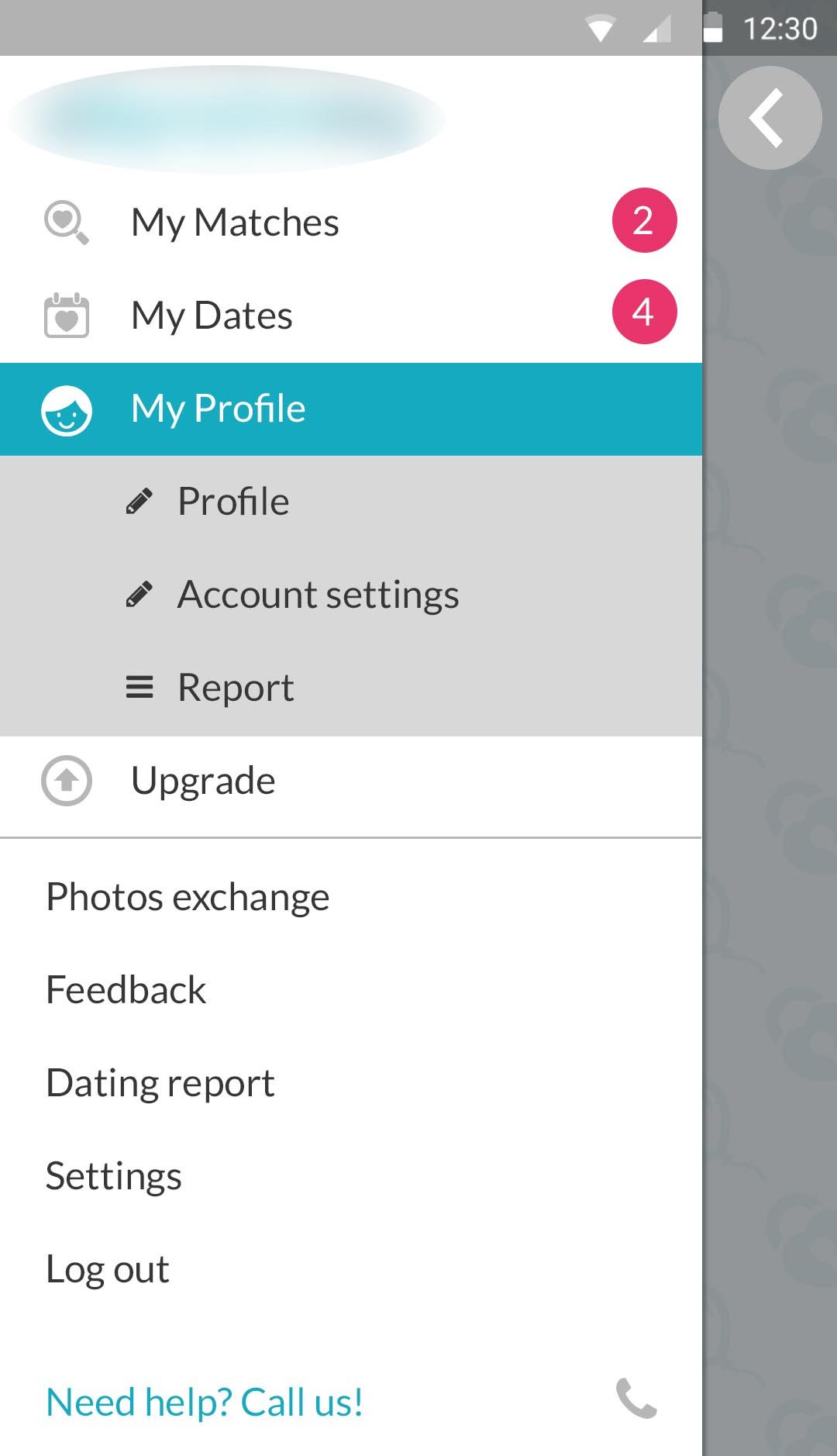
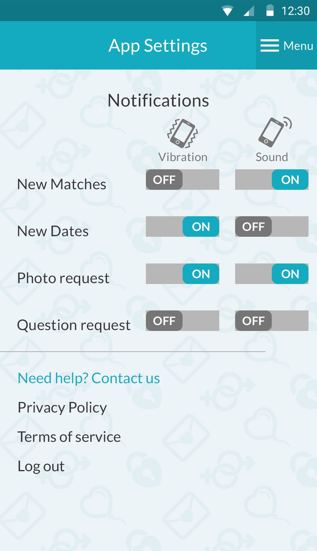
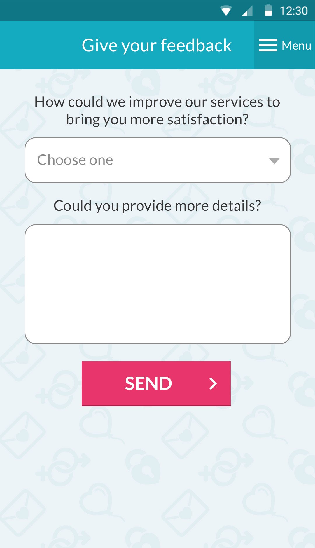
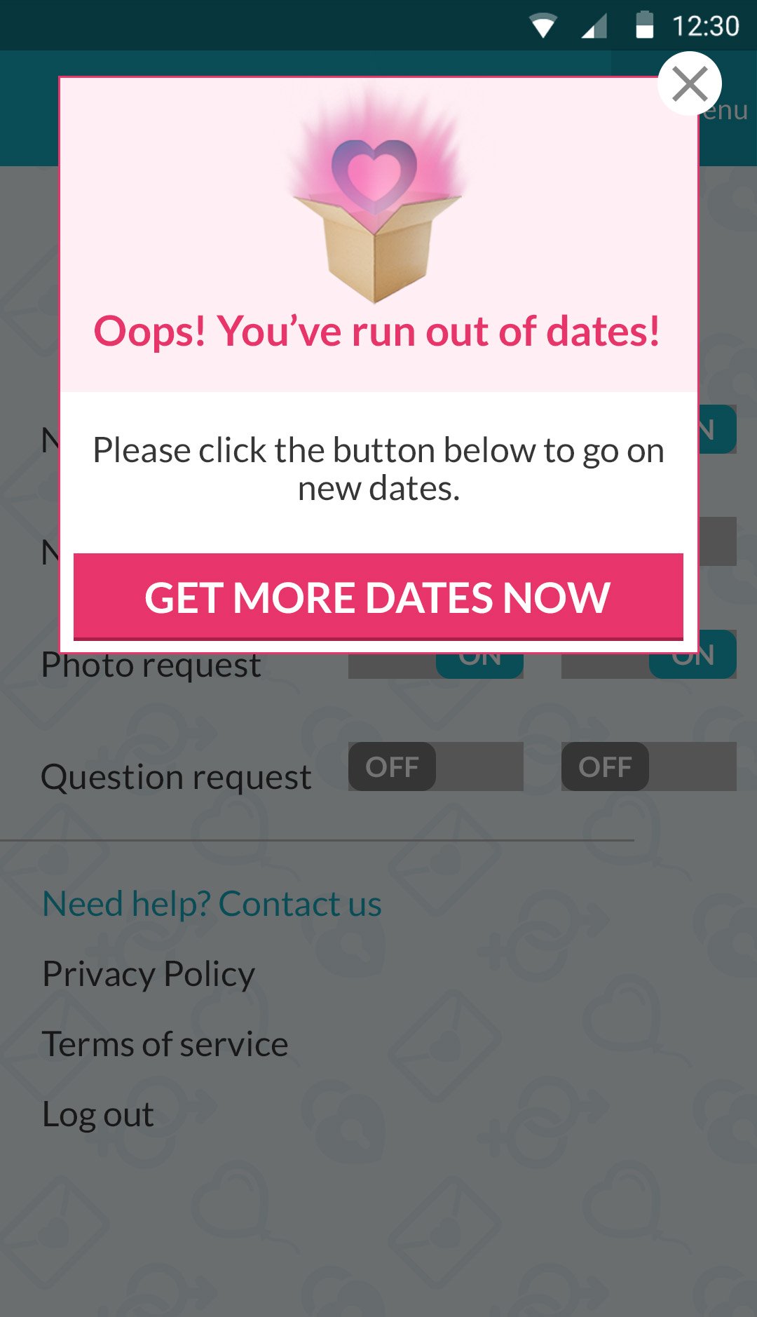
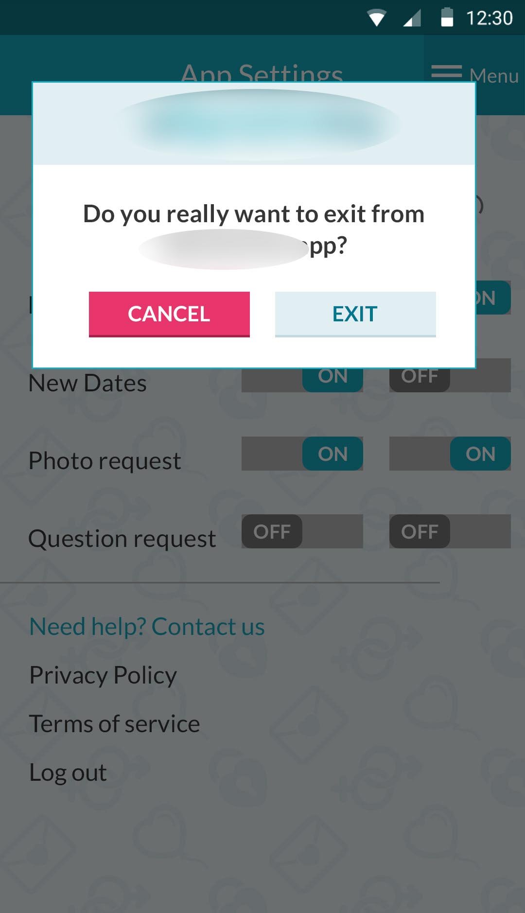
App redesign
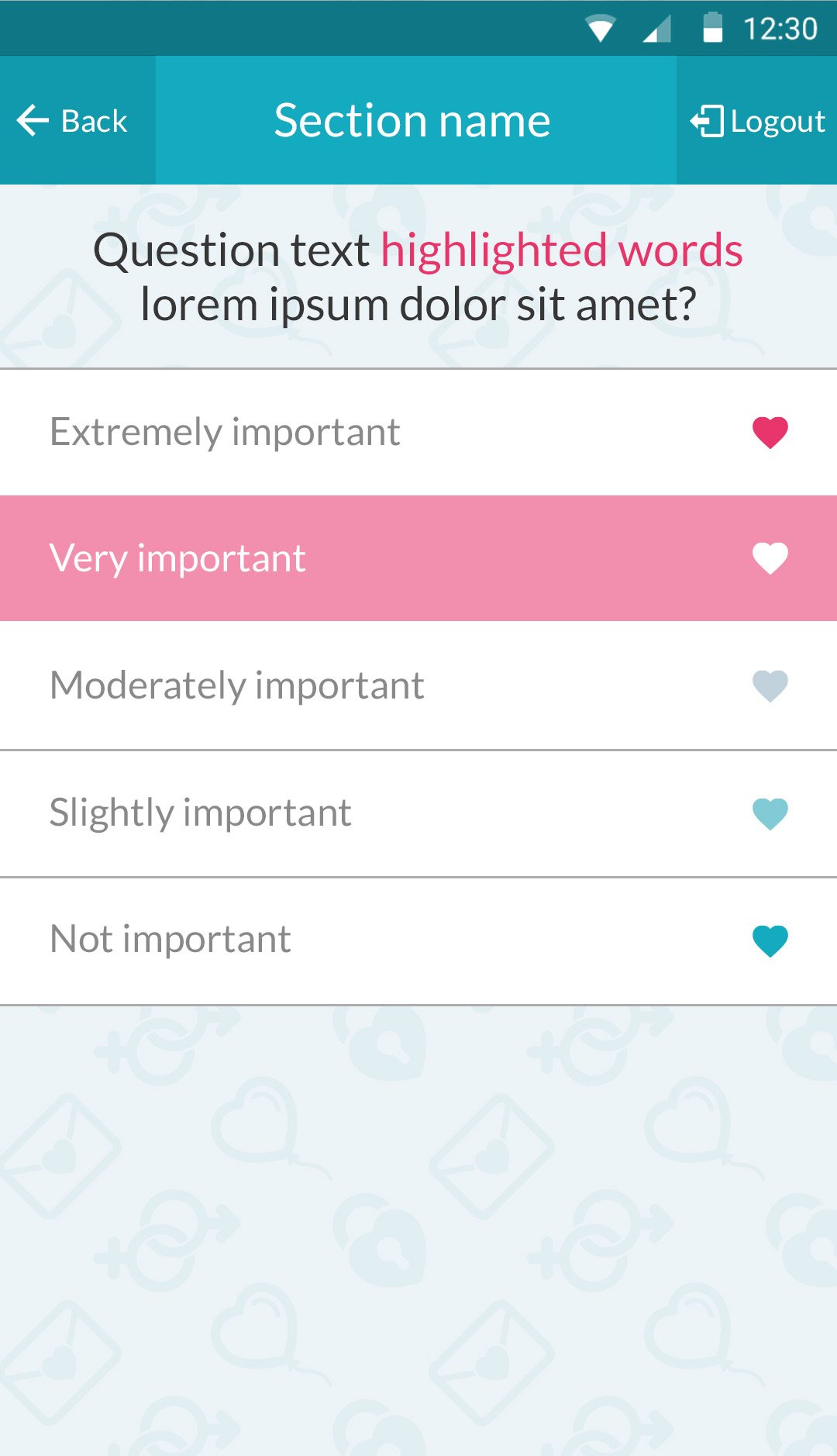
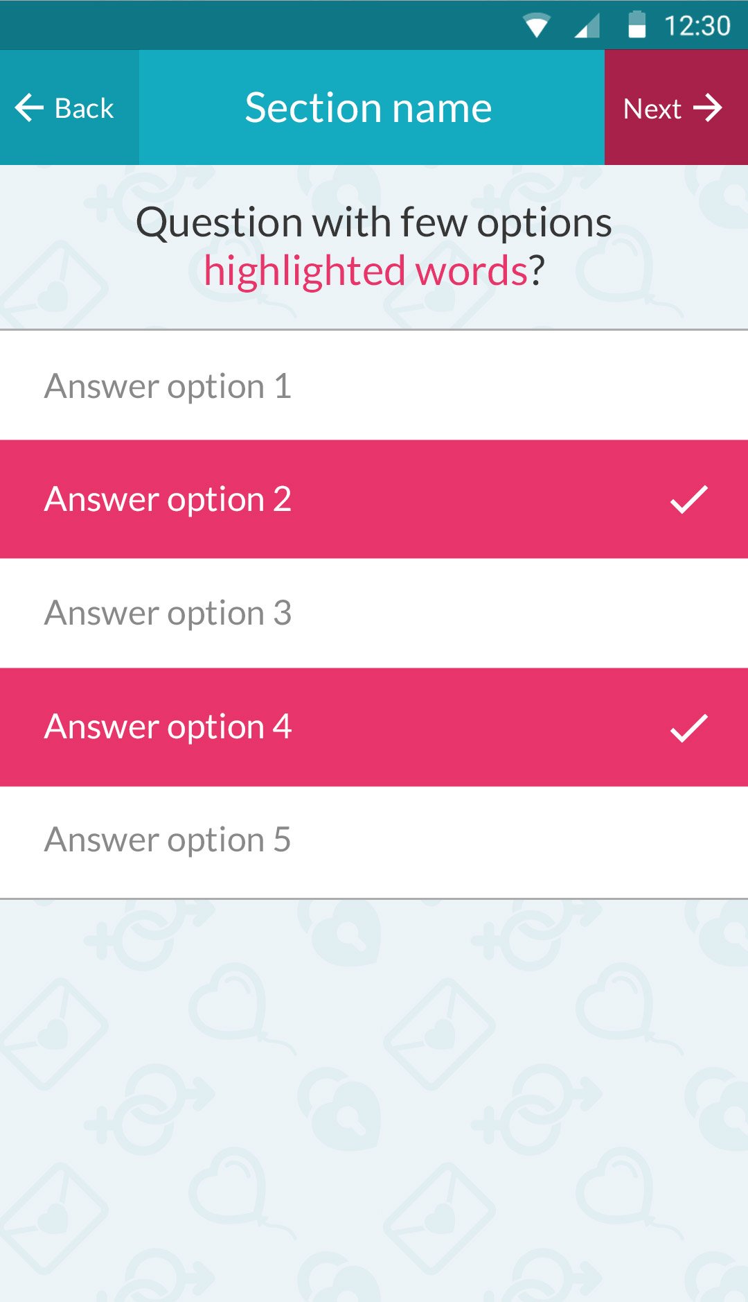
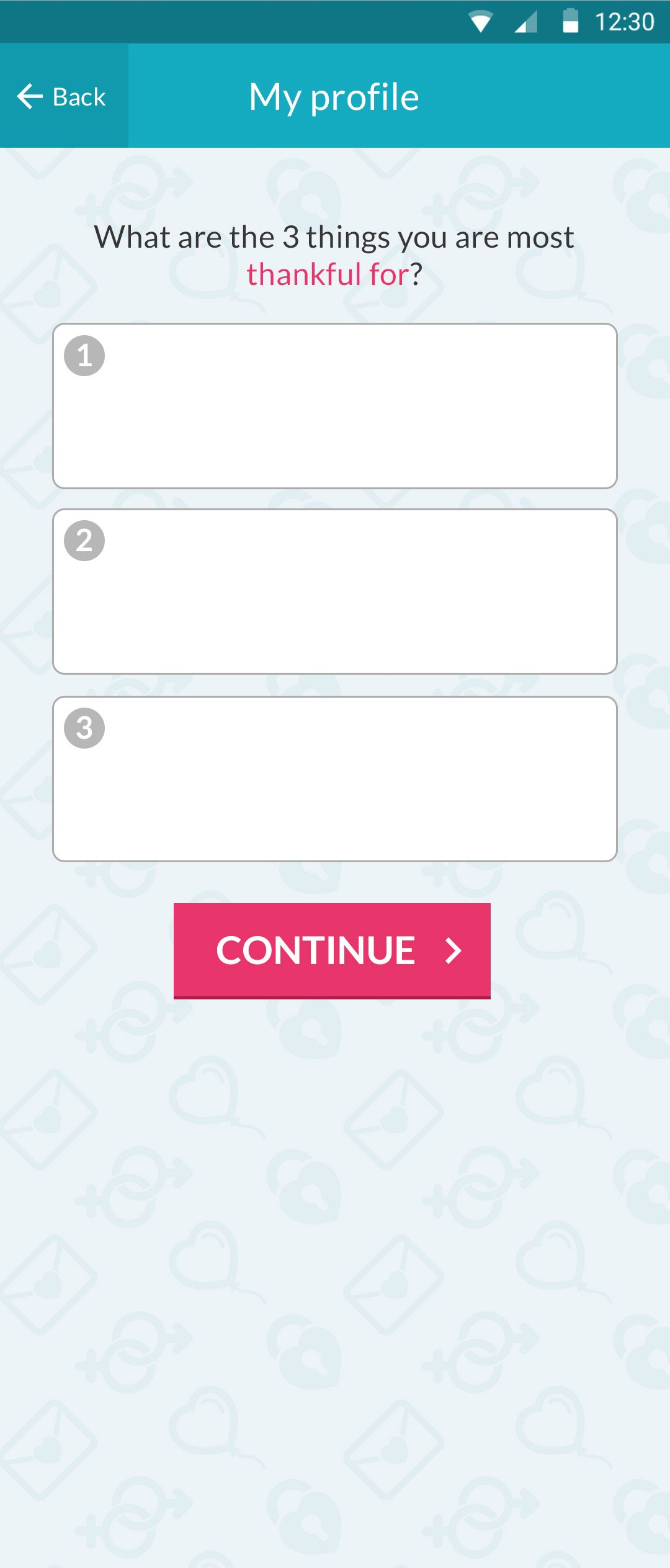
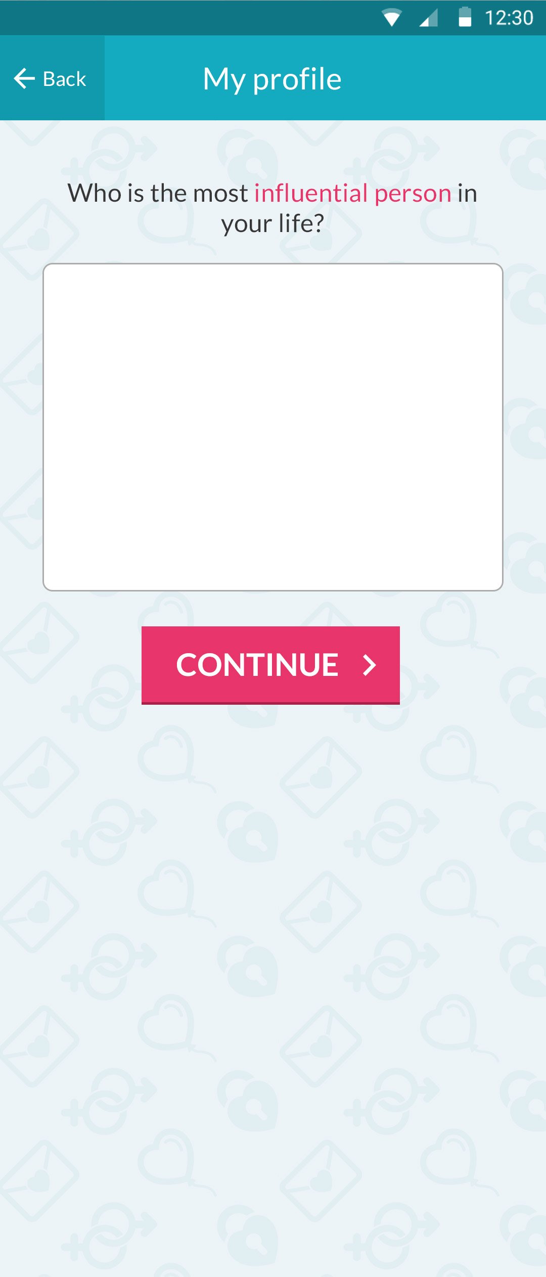
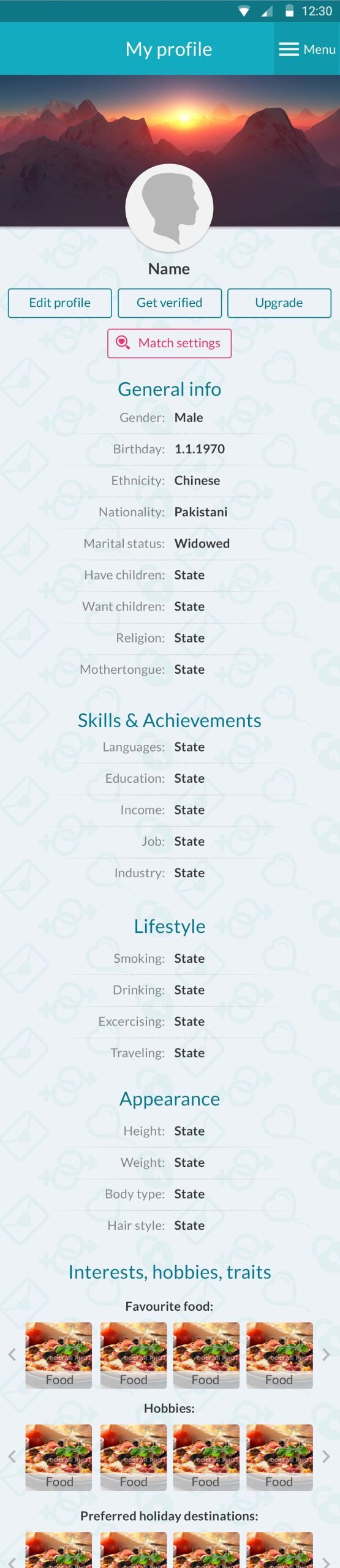
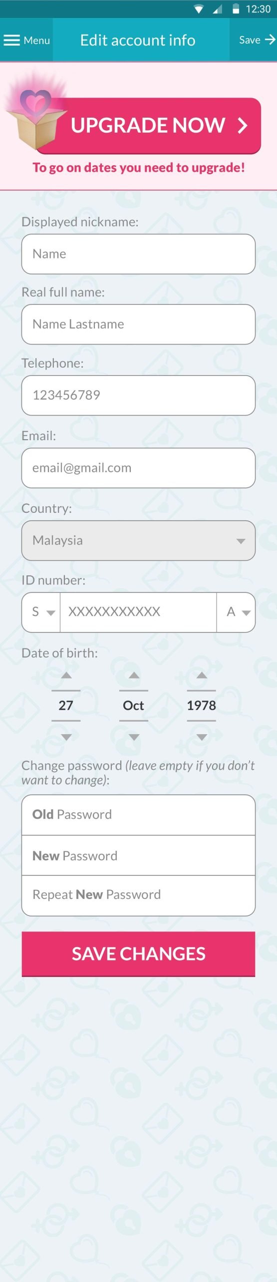
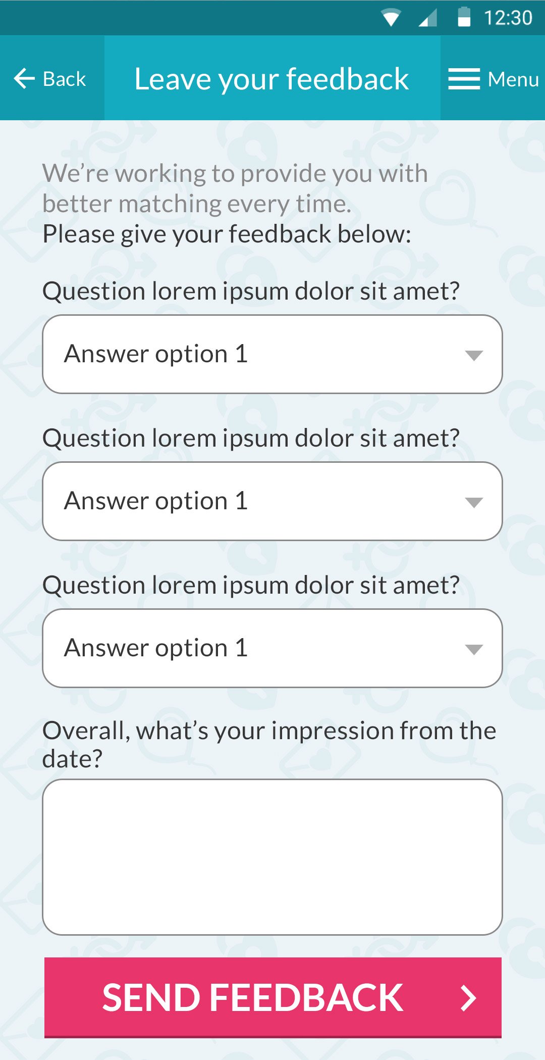
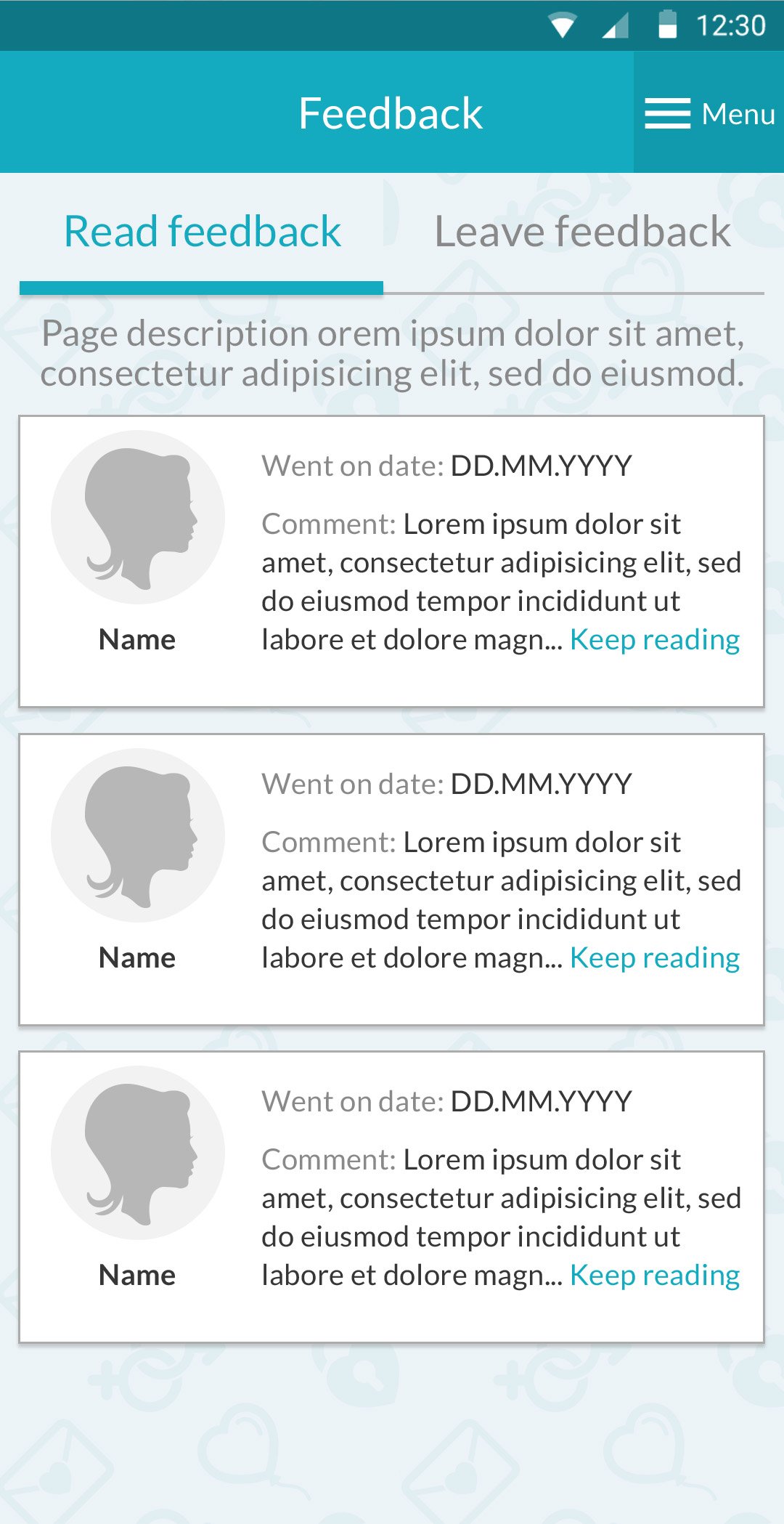
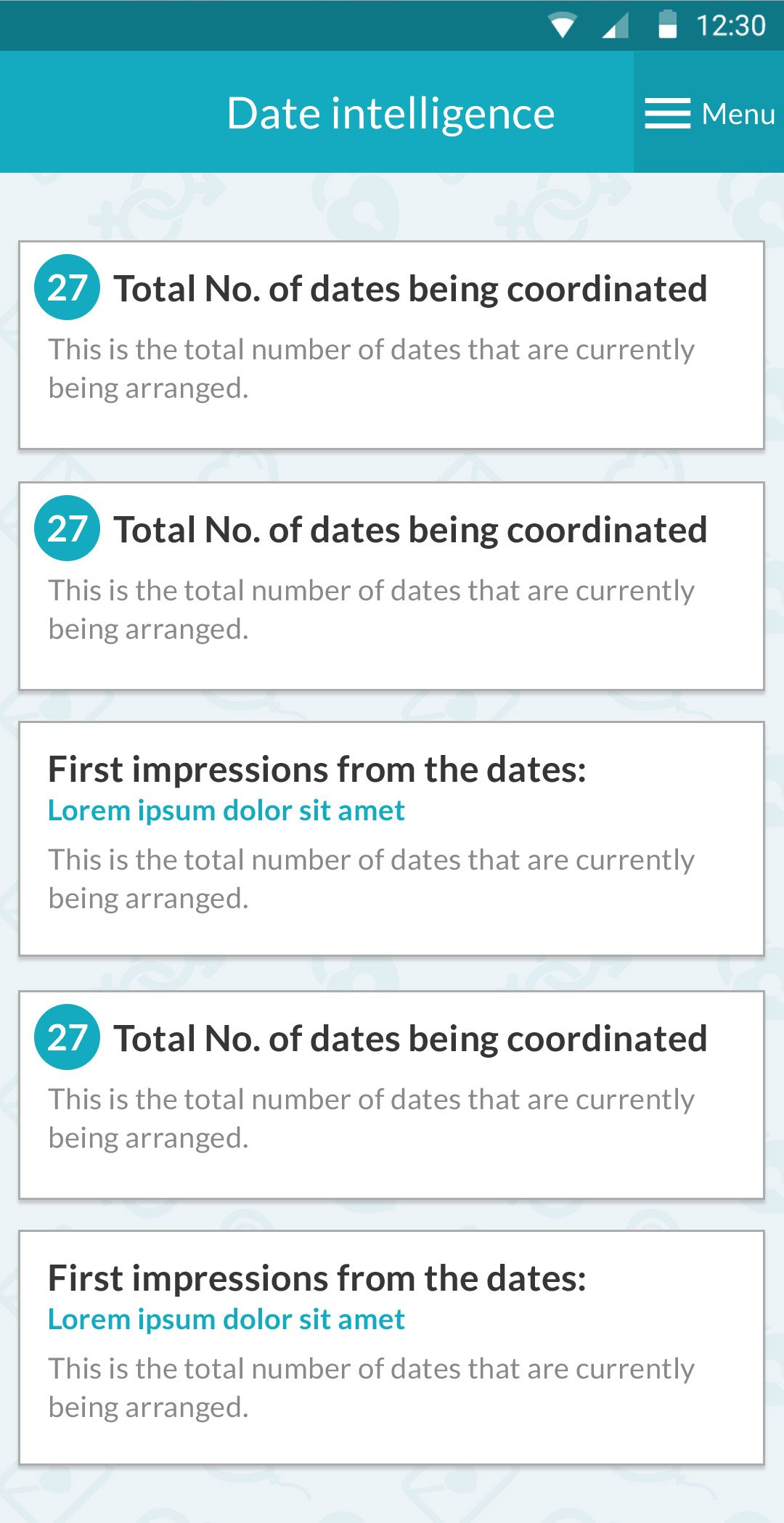
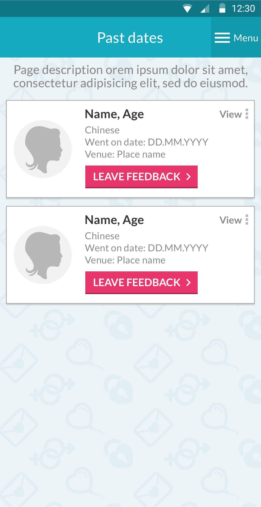
Next step – Optimizing the online purchase funnel. Company representatives were having a hard time since all sales were made by phone. They would call each person, gather an enormous amount of personal information for the personality quiz, and then convince them to pay for the matching services.
From this step, I dived deep into redesigning the user flow and creating all the screen designs.