Scroll Top
cro case studies

goal

  • Increase lead quality & conversion rate

my role

CRO Designer

  • Research & Strategy
  • Site Redesign Using Emotional Targeting
  • UX & UI improvement
  • Copywriting
project 1
eCommerce site
+550% in revenue

Research & Insights:

  • Mainly mothers, decorating their own or children’s rooms.
  • Messaging focused on product itself, not lifestyle.
  • Analytics showed that most users dropped off after browsing product categories.
  • Rotating slider was distracting, images not appealing
  • Bullets looked clickable but weren’t.
  • Search bar (most clicked!) buried at the top, not prominent.

Original design:

results:

sales: +550% 🚀
Avg. order value: +26%
Bounce rate: –42%

Redesign – inspirational over functional, lifestyle over product:

  • Hero visuals now show styled interior instead of flat decals
  • Removed slider to improve load time and focus attention
  • Tested two hero images: kids-oriented and grownups-oriented (kids-oriented won!)
  • Made search bar central and prominent
  • Removed confusing bullets
  • Shifted to a lighter look & feel
  • Improved UX & UI, offering users fewer choices < KEY TAKEAWAY

Would you ever imagine that such a tiny change could make anyone earn five times more money?

project 2

online presentations
+316% in signups

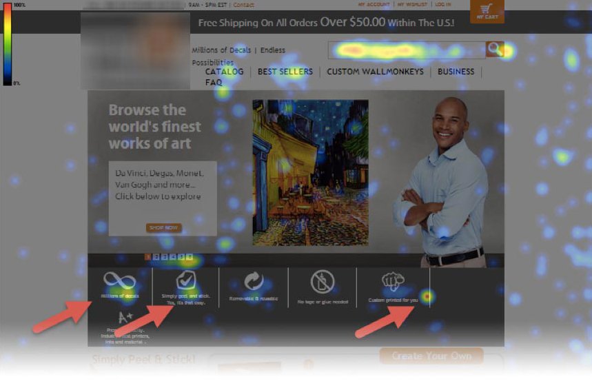
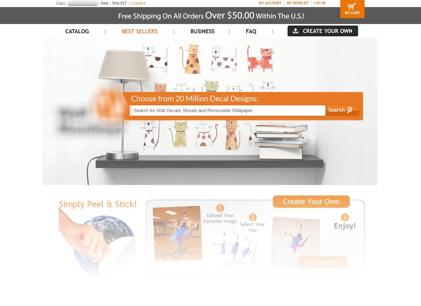
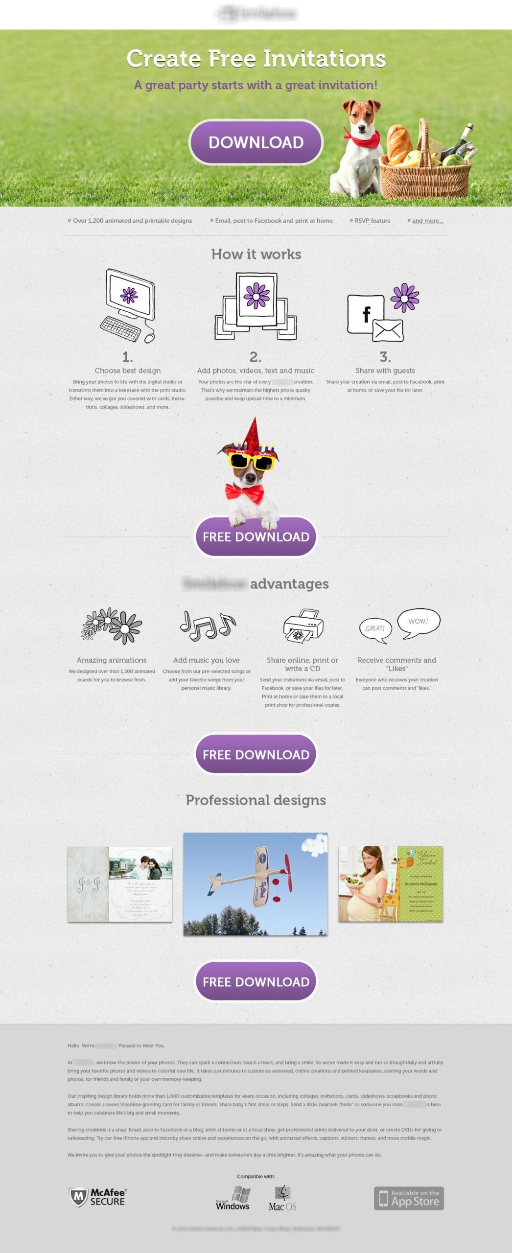
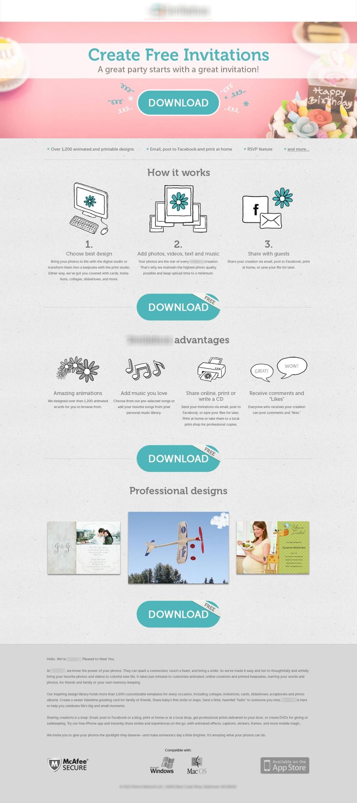
Based on market research, I created two personas for the marketing strategy — Jack and Jill. Here are the designs for both. Guess who won the A/B test?

Spoiler & Takeaway: swirls always work. If you’re out of concepts — just go for a swirl 😉

Original design:

project 3

fashion ecommerce
+115% in revenue

Original design had nothing to do with emotions. It was a functional, neutral online shop. While prom dresses are all about sparkling emotions! Applying emotional targeting to this segment of the market was very fruitful.

I designed one version with only a header image and tiny UX/UI tweaks. While in the second version I went for an overall party atmosphere, saving vertical space and thus avoiding a header image. And guess what? Version 1 with the header image won! That’s how one emotionally charged phrase, “Be the queen of the evening,” supported by basic graphics and a splash of color, does wonders.

Another interesting insight: after a slow start, users returned to make purchases, showing that emotional targeting drives higher-quality leads.

Original design:

project 4

online invitations
+65% in revenue

We don’t buy products — we buy how they make us feel.

Neuromarketing shows us to sell the promise: not invitations, but unforgettable events, perfect birthdays, weddings everyone remembers.

Results: same downloads, +65% more purchases.

Guess who won the A/B test? Cute characters usually win, and this is no exception. 😉

Original design:

project 5

b2b company
+78% in conversions

Interesting takeaway from this project:
In the first round of testing, we tried both versions with a “Log in with Facebook” button. In the second round, we took the winner and, paradoxically, added another step to the funnel. After the user clicks “Create your store,” they’re offered to log in with Facebook. Quickly, sign-ups rose by 35% and store creations increased by 78%.

Did I say that cute characters always win? Well, not in B2B, I guess. There are no universal recipes — that’s why you hire a chef. 🧑‍🍳

Original design:

more projects